Kansas City billboard mystery revealed
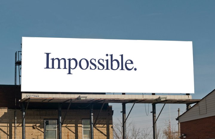
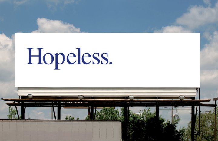
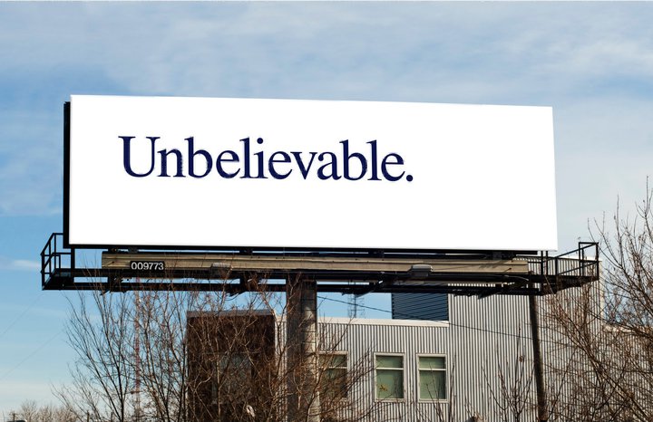
 They’ve kept Kansas City residents guessing for weeks: a series of simple white billboards with words like, “impossible,” “hopeless” and “unbelieveable,” across them.
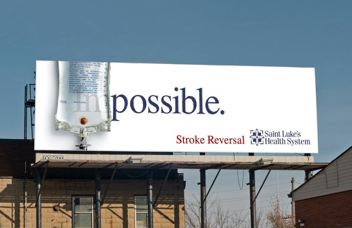
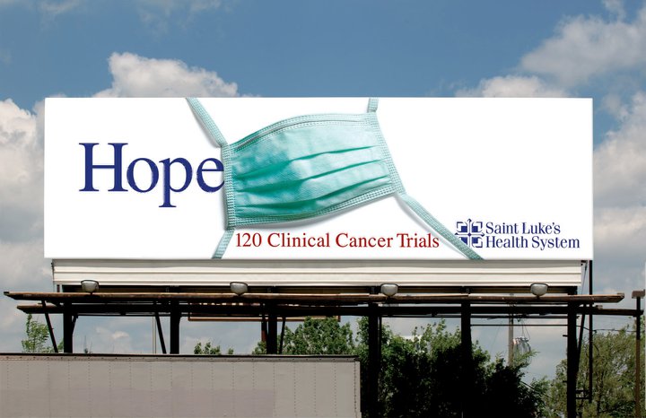
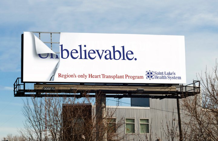
The mystery finally ended last week when it was revealed that campaign is all part of an effort to rebrand St Luke’s Health System, and re-establish their position as the area’s clinical leader in heart, cancer and nuero.
Theories about the mystery boards captured the attention of the local news, Facebook and the blogosphere. One of the teaser boards even ended up on the front page of the Kansas City Star. The reveal boards show medical objects like I.V. bags covering up the ‘im’ in impossible and masks covering up the ‘less’ in hopeless.
Copy revealed that Reversing Strokes was now possible and that 120 clinical trials gave cancer patients hope. The new branding campaign also includes newspaper, magazines and TV that launched on the Super Bowl. The theme of the new campaign is “Never Settle”.
 Agency: BVK
Client: St Luke’s Health System
Creative Director: Gary Mueller
Art Director: Scott Krahn, Michael Scalise
Writer: Gary Mueller
Photographer: Nick Collura
Retouching: Jim McDonald
6 Comments
Reminds me of 80s advertising
Deja vue
BBH johnnie walker
Identical
Phew. Thanks for clearing that up. I was losing sleep over that one.
Kansas is a long way from Oz. What’s going on? Why is this here? Can’t say I saw the mysterious billboards as I was driving through Kansas City on my way to work last week.
http://www.youtube.com/watch?v=fzEPNnd3Jh0
Must have been a quiet on the blog desk.