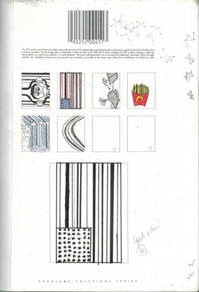
BARCODES ARE KIDS’ STUFF IN SCHOOL

A note from former Saatchi & Saatchi Auckland CD, Andrew Tinning, now ECD of Marketforce in Perth: “You might find this interesting given the controversy over the barcode work at Cannes – was going through my son’s Year 8 art folio with him the other day and came across this project he did a couple of terms back – apparently a standard part of the curriculum.”
Whoever wrote that brief to the kids as part of their “Problems: Solutions Series” (above), deserves the Titanium. It reads: “The UPC mark is one of the most widely used symbols in the world, appearing on packaged goods, magazines, paperback books and other mass-produced products. Yet this image seen so frequently is often not seen at all. With this in mind, redesign the UPC symbol, making it visible by interpreting it as a personal, political, or social statement. The areas indicated below are to be used for preliminary drawings. When all eight sketches are completed, choose one and execute it as accurately as possible in the larger area.”

10 Comments
awesome.is your son looking for a job. he should strike while the iron’s hot.
He could have won titanium!
How funny. How small must those judges feel now. Yes look at how cool we are awarding barcodes. We are so hip and cool and with it.Go bury your heads in the sand. The school kids are laughing at you as well now.
My theory on the whole controversy is that the Western and Eastern worlds aren’t very well connected. So, whenever, for example, a Japanese agency does work the American world has never seen, they think it’s fresh. And vice versa.This is what may have happened with the whole Titanium Lions fiasco.
Baaaaaaaaaahcodes! Does anyone at Cannes Lions even know how stupid they look? Or do they even care given how much they make in revenue every year.
Sure, ‘design barcode’ may have been invented in the west, but I’m sure it has never been this friendly, or fuel efficient.
My theory is that the titanium award sucks a big one.
I’m looking at matchbox designs for next year’s Cannes. I have this great idea of a red box, with two sides you can strike the match on. And the tip of the match is red, to make it go faster. And on the cover of the box will be a subtle image of a chick that looks like she’s giving felatio.Think of got a chance at titanium??The whole design community thought the barcodes was the funniest thing they’d seen. Do these judges get out and look at any related industries work at all??
who gives a shitreally as soon as promo lions with a star arrived it has all got a mite disengenuous..i hope that is how you spell it.
No, it isn’t.(Sigh) Bloody art directors.