Beyond the Brief: How +61 and Bear Meets Eagle On Fire turned Telstra’s humble phone box into powerful symbols of community support
In this edition of Beyond the Brief, Campaign Brief speaks with +61 Creative Directors Chris Cheeseman and Doug Hamilton and Bear Meets Eagle On Fire Chief Creative Officer Micah Walker about their striking campaign for Telstra. Together, the agencies transformed the enduring Telstra phone box into a meaningful symbol of the brand’s ongoing commitment to supporting Australians in times of need.
Let’s start with the brief! What was Telstra looking to achieve with this campaign?
Micah Walker: It’s challenging for a brand like Telstra to share some of the things they do without it feeling corporate and self-serving. And yet, there’s amazing things Telstra does that don’t really get talked about, so that was really the brief; how can we share some real stories about the positive things we’re doing without it feeling disingenuous or self-important.
The phone box is such a nostalgic symbol for many Aussies. How did you balance tapping into that emotion while keeping the campaign feeling fresh and relevant?
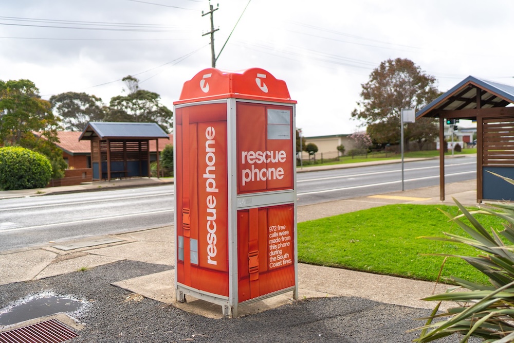
Chris Cheeseman and Doug Hamilton: That’s the thing, we often look at these phone boxes as relics from another time, but for so many people around Australia, they’re a vital part of the community. The work is all about highlighting the unseen role of these phones across Australia. We just needed to share it in a way people would notice.
Striking imagery is at the heart of this campaign. What creative thinking or visual references shaped how you made each execution feel both imaginative and meaningful?
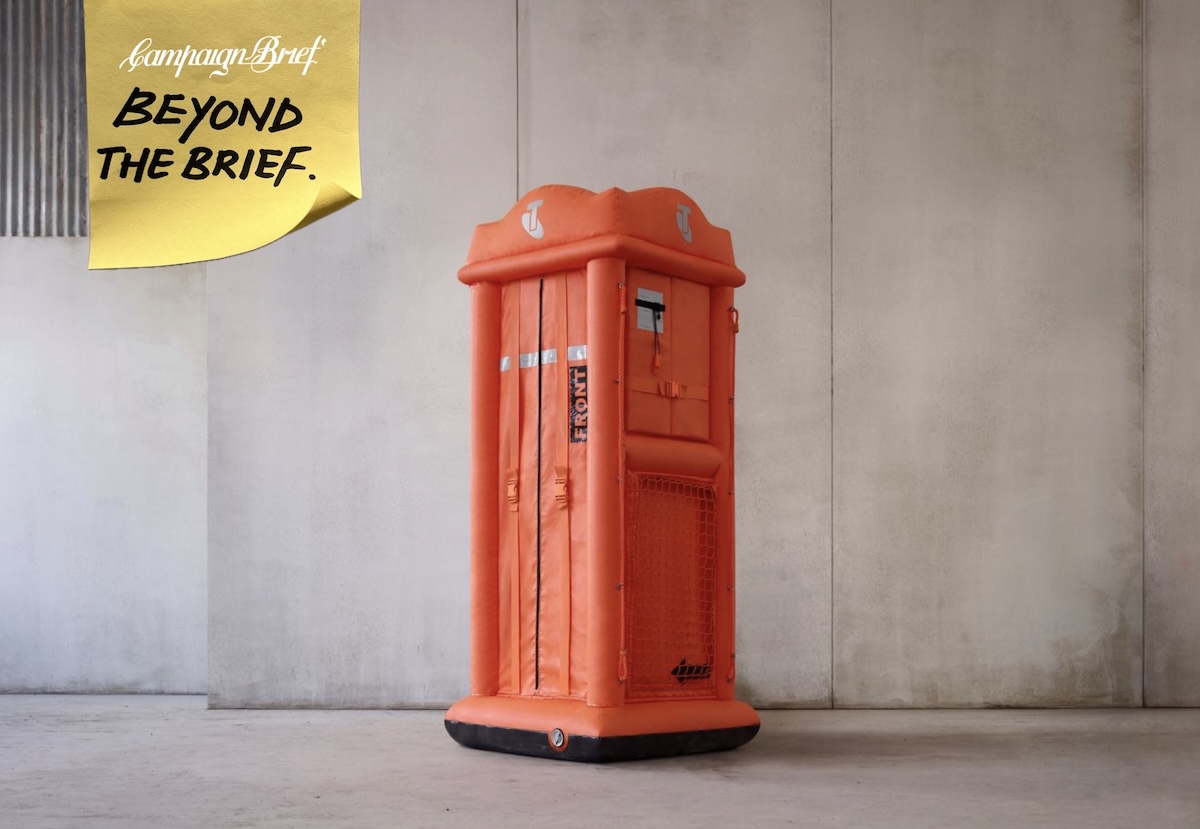
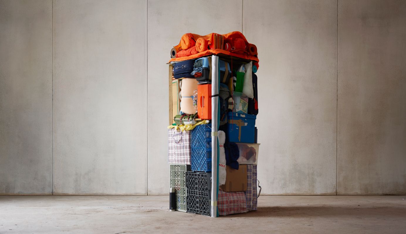
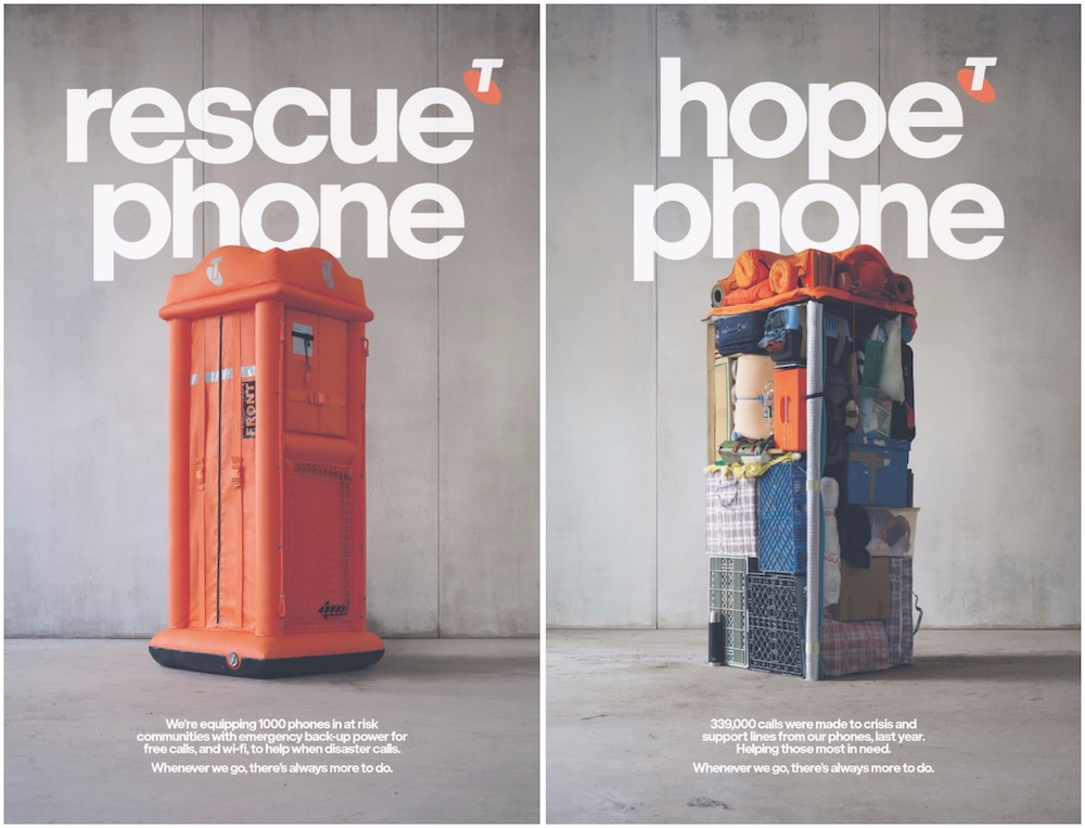
CC and DH: The silhouette of the Telstra phone box is an iconic part of the Australian landscape, a ubiquitous and very recognisable icon. So we decided to turn that shape into a simple visual metaphor for the help the phones offer communities in crisis.
The visual metaphors include life vests and items that represent homelessness. How did these concepts come together, and what was the process of designing and building them?
CC and DH: We decided early on that we wanted to approach the construction of the phone boxes practically, in camera. For the ‘Rescue Phone’, Dan [Tobin Smith, Director] and Rachel [Thomas, art director and designer] used similar engineering techniques and materials as real life saving devices, and worked with design engineers to build a phone that could inflate with the same urgency as a life raft.
For ‘Hope Phone’, we consulted with the Salvation Army to make sure the belongings were an honest representation of someone trying to get their life back on track. Rachel’s team constructed the design from these belongings on camera with a fair bit of skill and patience. It was quite satisfying to watch.
Speaking of Dan and Rachel, can you talk about what it was like collaborating with them, and how their vision helped bring the campaign to life?
CC and DH: It turns out that they’re as collaborative as they are talented, so what could have been a complex process, felt relatively simple and fluid. We had fairly detailed mock-ups and a lot of visual reference for each phone design, which helped too. Then it was over to Dan and Rachel to do what they do best. Rachel brought a new level of design sophistication to the project and Dan’s technical skills as image maker made sure they were the right mix of beautiful and humble.
If there’s one thing you hope people take away from this work, what would it be?
MW: That an important and meaningful part of what Telstra believes in and does is about a better future for all Australians. That this mission is an ongoing and genuine commitment. I think the line really sums that journey up perfectly – “wherever we go, there’s always more to do”.
Want to leave a comment? Share your thoughts below, making sure to include your full name and email address. If you have a news tip or story idea, please feel free to email ricki@campaignbrief.com.