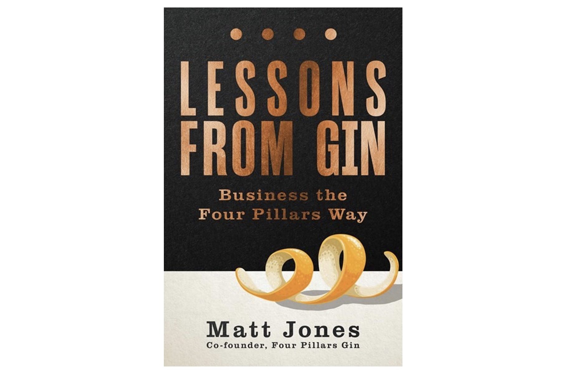
Four Pillars co-founder and creative strategist Matt Jones releases new book ‘Lessons from Gin’

How did Four Pillars Gin grow from a small Aussie craft gin distiller to a multi-award-winning global industry icon? In the new book, Lessons From Gin: Business the Four Pillars Way (Wiley $34.95), co-founder Matt Jones shares his side of the extraordinary Four Pillars story, revealing the secrets behind building a brand that started as a small cult favourite and became a beloved household name voted the world’s best gin producer three times.
Taking readers on his journey as a creative brand strategist during the rise of social media, Jones reveals how Four Pillars became a benchmark for excellence. He says that whilst it’s certainly not the definitive story of Four Pillars Gin but rather “my take on the decisions we made that helped grow Four Pillars into the world’s leading craft gin business in less than a decade.”
Prior to launching Four Pillars Gin with co-founders Stuart Gregor and Cameron Mackenzie in 2013, Jones worked as Chief Political Adviser to the UK Conservative Party, he moved into brand experience, working as Jack Morton Worldwide’s first chief creative and strategy officer. Between 2006 and 2012, Jones became one of the world’s most influential thinkers in the emerging world of brand experience, helping brands like IBM, Microsoft, Qantas, Sony, Samsung and Volkswagen navigate their way in a new era of socially-connected consumers and experience-led brand building.

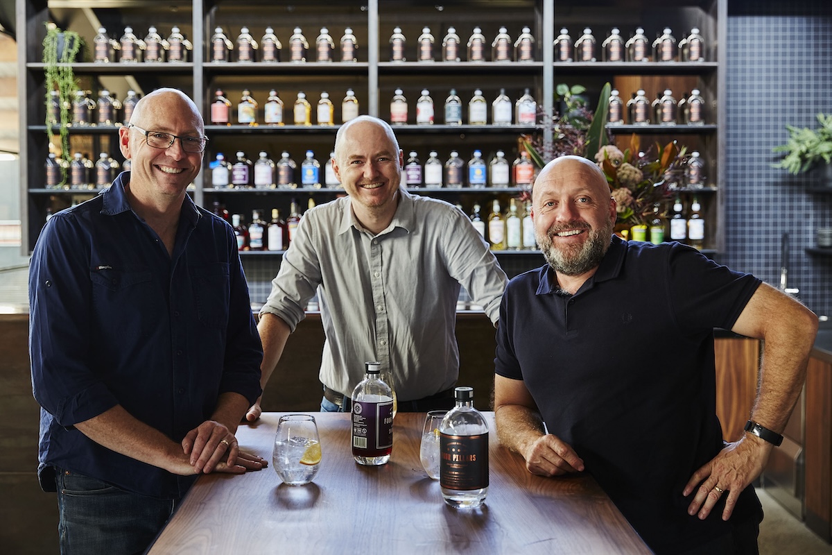
Eventually Jones (pictured above middle) would go on to form his own creative agency, focusing on applying creative strategy, storytelling and experience design to brand and business challenges for corporate, craft, start-up and social businesses before linking up with Gregor (far left) and Mackenzie (far right) to create Four Pillars Gin.
Says Jones: “As the person who contributed nothing (literally) to making the gin taste as good as it does (that was all down to Cam and Stu) I think my perspective might be the most relatable to others who also don’t have any gin-making talent, but who do have an extraordinary product and business they want to put on display and make sure it gets the credit (and growth) it deserves.”
Packed with entertaining stories, savvy business insights, and delicious cocktail recipes, Lessons from Gin is published globally by Wiley on 30 October and offers a captivating look into one of Australia’s greatest success stories and how you too can craft a brand that people will love to want.
Please enjoy an exclusive excerpt from Lessons from Gin below:
The irony of how we went about crafting Four Pillars is that, while we have always been about the gin first and foremost, we were actually developing our initial brand designs and packaging in parallel with Cam developing the gin. So, we were designing an idea of what we wanted the Four Pillars brand to represent even though we didn’t have the final gin recipe yet.
My brand education had begun years earlier. Brands, the way I see it, do not exist. Real things exist – banks, airlines, trainers, gins, cities, celebrities, political parties – and we all have feelings about these things. We can rationalise these feelings, but they are not in themselves rational. Brand is just a word we use to describe the sum total of these feelings, these biases, towards a business. When enough people have the same strong, positive feelings and biases towards a business, you’ve got a strong brand on your hands.
That’s all fine in theory, but here I was facing the reality of my first opportunity to help hardwire bias and emotion into my own business. For now, the remit was strictly design and storytelling.
We needed a bottle, and we all agreed that you only got one chance to be original, so we wanted a bottle that was custom and unique to our business. We needed a label to put on the bottle, and that meant we needed a name to put on the label, plus a story to go on the side of the label. And soon, we would need the beginnings of a playbook to help us make other decisions, from designing our six-pack cases to thinking about our website.
First up was the bottle. Along with selecting our still (we named her Wilma after Cam’s late mum) and our gin botanicals (a work in progress as we awaited Wilma’s arrival), choosing a bottle felt like the next most substantial decision we would make. The bottle was literally how people (both bartenders and drinkers) would pick up and hold our brand. If it didn’t feel right in their hands, the gin might never make it to their mouths.
We talked a lot about what kind of brand we wanted to be. At the time, there were lots of new gin brands being launched overseas (the Australian craft gin boom was still to come) and some were leaning into their newness with radically modern bottles. We explored options for a bottle shape that would feel really disruptive, but we feared that something too ‘2013’ could start to feel tired within a few years. That helped us realise that a timeless sense of quality was a critical part of the brand we wanted to create.
Stu led the charge with bartenders, peppering them with questions about bottles they liked or didn’t like and showing them early mock-ups of our proposed bottle. We learned that a shorter bottle was favoured (more stable and hefty in the hand), but not too wide, so even someone with smaller hands could comfortably pick it up and pour with one hand. And the neck should be long enough to make it easy to pour a shot without dribbling at the end (something multiple bartenders told us frustrated them about the very stubby neck on the Hendrick’s bottle).
In parallel with this work, our design agency partners started working on the label design, showing us things that were both super contemporary and more traditional. And, again, we aimed to strike that balance of timeless, crafted luxury – not too modern or sterile, but also not too retro, fancy or projecting fake heritage. We wanted something clearly premium, but also restrained and not over the top.
Lastly, we needed a name to put on all this design work. Over my years as a brand strategist and consultant, naming has always been my least favourite part of the job. In short, there are no good names, but there are bad ones.
So many great businesses have names that started out clunky like ‘Facebook’ (a compound name, originally prefaced with a clumsy ‘The’), a bit random like ‘Google’ (a misspelling of a very big number), rather obscure like ‘Tesla’ (a dead, famous-ish scientist) or, in the case of the Australian unicorn Canva, needing a full rethink (Canva was a French-inspired pivot from its previous, and objectively terrible, name Canvas Chef). In all cases, the key was not the name, but the meaning built into the name over time.
The not terrible name we came up with was ‘Four Pillars’. What does it mean? Well, it depends on who you ask (there’s a non-sanctioned and inappropriate version Stu is liable to tell after a few Negronis). The official story is that ‘Four Pillars’ refers to our belief in the need to do a few things to an exceptional standard. It’s a belief in focus, excellence and simplicity, like the world’s greatest cocktail, the Negroni (equal parts gin, Campari, sweet vermouth and good ice). We added the word ‘gin’ to the end, making the official brand name Four Pillars Gin, emphasising our absolute focus on the craft of making gin and only gin.
The last piece of the brand puzzle was to agree on colours. Gin was dominated by blues (Bombay Sapphire), greens (Tanqueray) and reds (Gordon’s, Beefeater). The outlier was Hendrick’s with its almost medicinal dark black bottle. As we were looking to compete with Hendrick’s at the top end of the price bracket (over AU$70 a bottle), we wanted to pick colours that communicated status, premium and (again) timelessness. The end result was our iconic black label with copper foil.
I’m so glad we held our nerve on all those decisions, from sticking with the black label (despite some people saying that gin was a summer drink and black was too dark, heavy and wintery) to sticking with the name Four Pillars (despite someone warning us that the number four was unlucky in Chinese) to making the big investment to have a custom-moulded bottle from the outset (despite the minimal order soaking up far too much of our limited cash to purchase glass we wouldn’t need for ages). Because the truth is that, while so much about our brand has evolved and grown since those initial design explorations in 2013, our core Rare Dry Gin bottle has remained broadly untouched and already feels like an icon on the world gin scene.
