TABOO unveils new rebrand and positioning: ‘Breaking Bad Rules for Good Reasons’

TABOO, the independent creative agency known for challenging the status quo, has unveiled a bold new rebrand to celebrate 24 years of defying conventions. With the positioning “Breaking bad rules for good reasons,” TABOO, a long-standing B-Corporation is doubling down on its mission to deliver work that doesn’t just grab attention but drives meaningful change.
Since launching on the streets of Melbourne in 2000, TABOO has been anything but ordinary. The agency’s unique approach has seen it create work in diverse forms including documentaries, beauty festivals, road safety technology on permanent display at Melbourne Museum, as well as its own floating bar on Melbourne’s Yarra River. With a healthy cynicism of traditional advertising, TABOO has consistently crafted campaigns that are unexpected, memorable and take its audience out of ‘Vanilla Valley’.
This fresh positioning isn’t just about being different—it’s about making a difference. By breaking outdated rules, TABOO continues to embed brands deep into culture, creating work that’s as meaningful as it is memorable. The new approach reimagines the advertising landscape with innovation at its core—delivering design, content, and experiences that culture actually cares about.

Says James Mackinnon, managing director, TABOO: “Our whole ethos has always been to push boundaries and challenge expectations. With ‘Breaking bad rules for good reasons,’ we’re taking that spirit to the next level—turning constraints into creative opportunities for clients who refuse to blend in.”
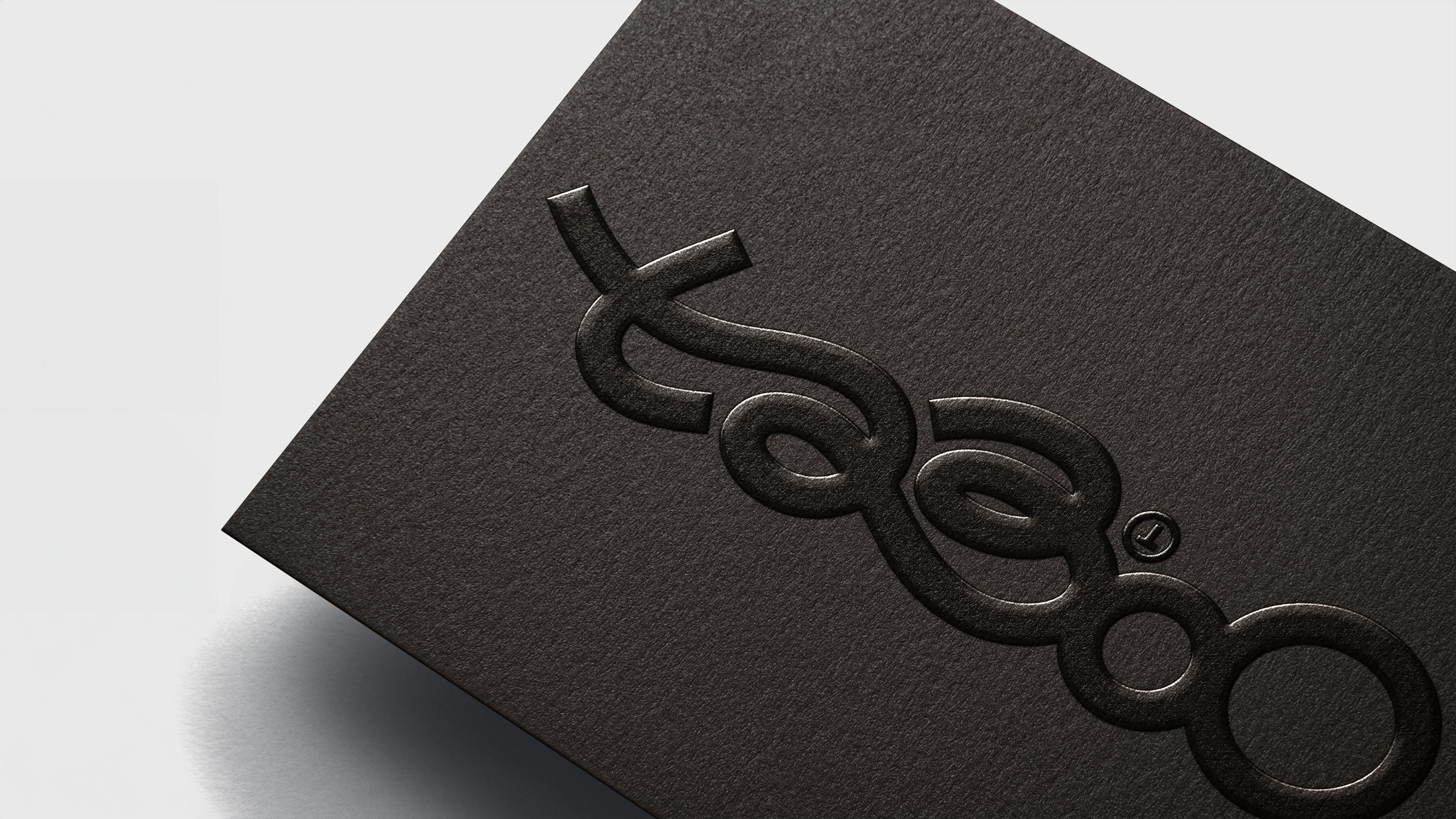
In line with its bold new positioning, TABOO is unveiling a refreshed visual identity that captures the essence of its rebellious spirit. The new logo is not just a redesign—it’s a reimagination of what ‘taboo’ means in today’s world. By embracing a playful yet sophisticated aesthetic, the logo reflects the agency’s commitment to breaking boundaries and embracing change. It’s a visual metaphor for TABOO’s diverse and evolving body of work, which refuses to be confined by convention.

Says Andrew Mackinnon, CEO and founder, TABOO: “Our new visual identity is more than just a fresh typeface. It’s a symbol of the bold moves we’ve made over the last 24 years, and a statement about our Vision – to be the most notorious creative agency in the world. This logo embodies our belief that the most powerful ideas are those that don’t follow a formula and engage people on a more meaningful level.”
TABOO recently appointed Charlotte Adorjan, former creative director at AMV BBDO London, to lead the creative department. With Adorjan at the helm, TABOO is set to reach new heights of notoriety and innovation, reinforcing its position as a positive creative force in the industry.


6 Comments
Seriously HOT
is fire
22 years of brand salience and logo recognition to start again with a completely different logo where people need to figure it out for themselves. Crazy.
‘Breaking Bad’ does rule and for good reasons!
Taboo is such a strong word. To see it treated this way makes me sad. t23o0
says every brand design guidelines ever.