Tired clichés surrounding Adelaide quashed in new ‘See for yourself’ campaign via Showpony
Adelaide – Boring. Conservative. Nothing to do. The City of Churches has a long-standing reputation for being bland, uninspiring and sleepy. But the truth is very different and is being revealed in a new campaign for the Adelaide Economic Development Agency (AEDA) developed by Showpony.
To encourage visitation from wider South Australia to the Adelaide CBD, Showpony, working with AEDA, decided to tackle these persistent stereotypes head on, with a new campaign “See for yourself”.
Says Rory Kennett-Lister, creative director, Showpony: “The perceptions of Adelaide have been around for so long that they’ve become reflexive. But the truth is that the CBD of today is a vibrant hub of food, fashion, culture and entertainment. So we set out to promote that truth with a quiet confidence, and to take those tired cliches and show how antiquated they are.”
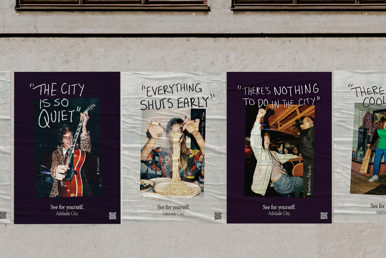
The campaign takes the most common criticisms of the Adelaide CBD and counters them, with real, images and content sourced from social media and street photography. These publicly sourced images are in stark contrast to the negative stereotypes, revealing them as the misconceptions they are.

Says Michael Rossi, executive manager, marketing, AEDA: “Playing with a negative is always a risk. So authenticity was key. We wanted something that reflected the real Adelaide. When the team suggested sourcing real images, rather than shooting something for the campaign, we jumped at the idea.”
The campaign runs across video, social, digital, outdoor, press, PR, and features custom music that takes negative comments about the city, cuts them up, and creates a track that’s ready for the dancefloor.
Says Abby Moulton, associate creative director, Showpony: “We loved the irony of taking the accusations of Adelaide being boring and making people want to dance to it. We took the idea of a diss track and flipped it.”
Says Laura Prior, account director, Showpony: “You know a concept is working well when the public pick up the idea and run with it. The “See for yourself – Adelaide City” track is growing organically, currently available on Spotify and being used on both Instagram and TikTok as the soundtrack to timely content that showcases people enjoying the CBD.”
The campaign is anchored by SeeADL.com.au, a website which provides an easy-to-use, customisable directory, to help navigate the city’s attractions, plan a night out, or discover Adelaide’s best kept secrets.
The platform also extends beyond traditional campaign avenues, with spotlights on businesses, street-talks with visitors about their favourite things to do in the city, and “Where to next?” teaser posters. The posters use QR codes that reveal nearby establishments and experiences to discover, to ensure the good times keep rolling.
So if you think Adelaide is boring, think again. Better yet, see for yourself.
Client: Adelaide Economic Development Agency (AEDA)
Creative Agency: Showpony
Executive Creative Director: Parris Mesidis
Creative Director: Rory Kennett-Lister
Associate Creative Director: Abby Moulton
Senior Creative / Copywriter: Andy Scott
Art Director: Annika Turon-Semmens
Producer: Alex O’Neil
Digital Lead: Matthew Basso
Motion Graphics Designer: Felipe Carrasco
Head of Strategy: Ana Coelho
Account Director: Laura Prior
Account Manager: Julia Palombo
Sound / Music Designer: Scott Illingworth, Seeing Sounds
Photography – Various

13 Comments
Look, addressing the stereotypes about Radelaide seems pretty sound, strategy-wise, and while the line ‘See for yourself’ is not even close to the brilliance of Tassie’s ‘Come down for air’, I don’t hate it.
But where this really falls down is the awful execution of the video/TVC.
Surely the target tourist demographic they’re hoping to attract to Adelaide are more than just ‘Gen-Zs with woeful taste in music’? I mean, sheesh… even if they led with Aussie hip-hop, hydroponic weed and Snowtown serial killers, this would’ve been arguably better.
https://campaignbrief.co.nz/2022/06/28/karangahape-road-business-association-celebrates-real-bad-reviews-in-latest-be-our-guest-tourism-campaign-via-motion-sickness/
Australia’s best kept secret.
McLaren Vale.
The street poster says ‘everything shuts early’ and the proof that that is not the case is someone eating pasta at 9.43pm?! Only in Adelaide would people think 9.43pm is staying out late.
Talk about damning with faint praise
the secret is that it’s really just massively average. Much like this campaign.
The last time I went to Adelaide, it was busier than North Sydney in the late 90s. Which says more about Sydney than it does about Adelaide.
Thats absolute horsehsit. The pictures are art directed and curated.
Ip theft. Makes Adelaide look like a place with no original ideas.
Now, it’s NEEDY AF.
Bland, uninspiring, sleepy. Brisbane Tourism used the same strategy 17 years ago – Yes, It’s A Sleepy Little Town. https://www.youtube.com/watch?v=9-ZPjXjSQKM
I hate it
drinking, pizza, and the art gallery. Apart from the pizzas, all have deteriorated in quality. The lame song makes this ad even more embarrassing. At a guess. This is embarrassing.