Gatorade No Sugar launches new ‘Water wasn’t made for this’ brand positioning via Akcelo
Gatorade has launched a new brand positioning ‘Water wasn’t made for this’. The work is a powerful reminder that intense and sweaty workouts may call for more than what water can provide – specifically the electrolytes, sodium and potassium of Gatorade No Sugar. The new positioning has been created by brand experience agency Akcelo, and launches with a fully integrated campaign Australia-wide.
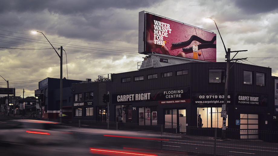
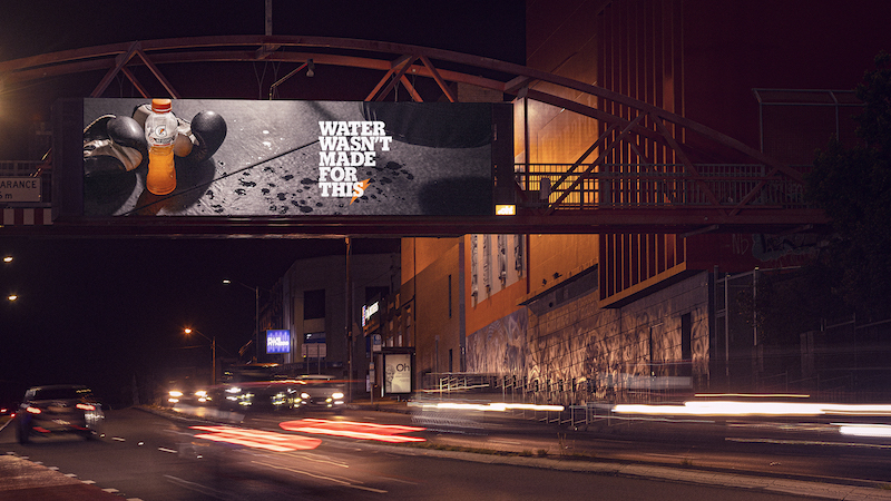
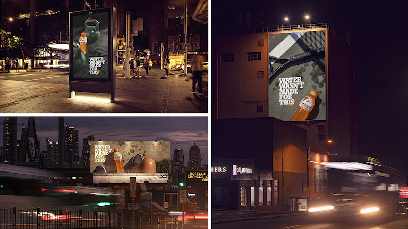
The launch film, shot by TAXI Films’ Justin McMillan, is an ode to water that acknowledges its importance to life as we know it, whilst also recognising where water’s limitations lie. Similarly, the OOH, shot by Chris Searle at Title Artist Management, demonstrates how the raw physical exertion of workouts like a sweaty gym session, a breathless run, or a scorching hot tennis match demands Gatorade No Sugar.
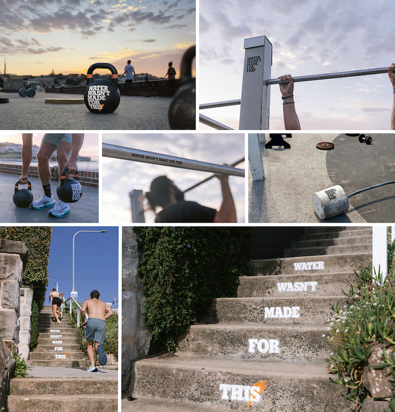
Beyond film, outdoor and social, ‘Water wasn’t made for this’ extends to ambient placements where exercisers sweat the most – at the top of a gruelling flight of stairs, on heavy kettlebells, pull-up bars and even at outdoor gyms.

Says Vandita Pandey, chief marketing officer ANZ of PepsiCo Snacks and Beverages: “This new positioning puts a really relevant spin on hydration, something exercise fanatics take extremely seriously. It’s exciting to go beyond the usual media placements and utilise some hyper-targeted opportunities to speak to people during sweaty moments.”
Says Aden Hepburn, CEO of Akcelo: “In a category defined by fast-paced, high octane visuals and nothing but glossy, muscular and impossibly toned physiques, we opted for a different take – a powerful insight, executed with stillness, simplicity and craft. This work represents a big shift for our partners at PepsiCo, and we couldn’t be prouder to play our part.”
Gatorade, a household name globally which was developed to meet the needs of athletes, has a long history of aligning itself to sweat and physical exertion. ‘Water wasn’t made for this’ marks a bold new move for the brand.


Agency: Akcelo
Group Creative Director: Louise McQuat
Creative Partner: Jon Foye
Creatives: Henry Wall, Grga Calic
CSO: Dave Di Veroli
Strategy Director: Sarah Tan
Client Partner: Sarah Pang
Account Director: Raquel Ware
Senior Producer: Stephanie Ceccaldi
Integrated Producer: Dan Burns
Executive Events Producer: Michal Frydrych
CEO: Aden Hepburn
Client: PepsiCo Australia
Vandita Pandey, CMO ANZ Snacks & Beverages
Susan Press, Head of Beverages Marketing, ANZ
Eric Burke, Marketing Manager
Brad Fisher, Brand Manager
Belinda L’Estrange, Marketing Manager
Judith Myers, Insights Manager
Film Production: Taxi
Director: Justin McMillan
Post production: The Editors
Sound Post Production and Music Facility: Rumble
Stills Photography: Chris Searl

25 Comments
Shouldn’t the stair stencils be in the other order?
Agree. Stair stencils in wrong order.
This is pretty cool. Would love to see how they build on it.
I’ll be waiting to see what the haters say, but it’s a strong line with a nice idea at the heart. Congrats to Akcelo and all involved
Like I said, ‘great positioning’.
People read left to right and from top to bottom…who reads upwards?
Brilliant positioning, brilliant line, brilliant execution. Well done to Akcelo
Yeah dig this. Stripped right back, simple positioning and excellently crafted execution.
Nice one.
Probably people who are running up stairs?
Just makes me wanna drink water.
LMAO. I take it you’ve never run up a flight of stairs.
I beg to differ https://outdooradvertising.company/staircase-advertising/
It’s a nice line, well finished. Feels global. Well done Grga and co
Beautiful idea and craft. Well done
Is interesting but then you spend the whole time not showing what “this” is.
Wouldn’t it be better to show dramatised versions of “this” that maybe even build. Interesting, entertaining, unexpected things.
Then you’d just have every other sporting apparel or sports drink ad made to date.
Nice thought and line but running in nature is exactly the sort of thing water has been helping humans do since the beginning of time
Love the idea, the line, the stills, and the stairs. But, I reckon the motion is off tonally.
Than anything Gatorade or Powerade have done for a while. Hats off.
Clear, simple insight, killer execution. The team should be chuffed with this.
Are lazy and poorly crafted. This kind of stuff needs better still production.
I did not watch the ad. But I did read the headline and I immediately loved the insight. Great idea. Cool stuff, well done.
Isn’t Gatorade 99% water?
Ahh the conflict client agency strikes again, you know what would make me sweat? Having multiple competitors all working with the same agency
This is a really solid platform. Disagree with the words being around the wrong way on the stairs – unless you’re crawling on the ground up the stairs, this is correct placement. Look forward to seeing how this expands… so much you can do with it.