Temple & Webster makes every space beautiful in latest campaign via Howatson+Company
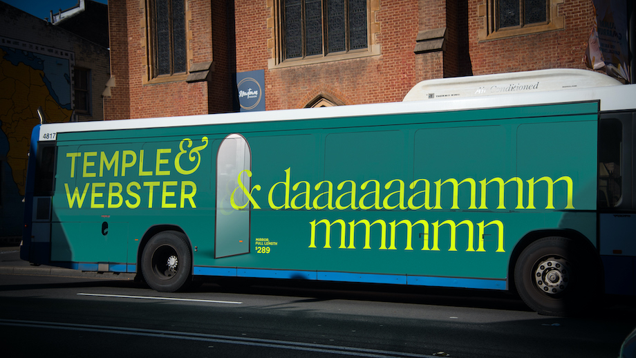
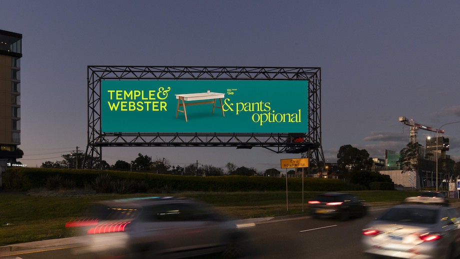
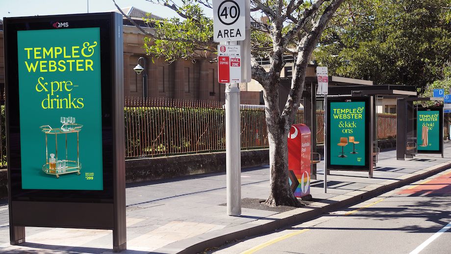
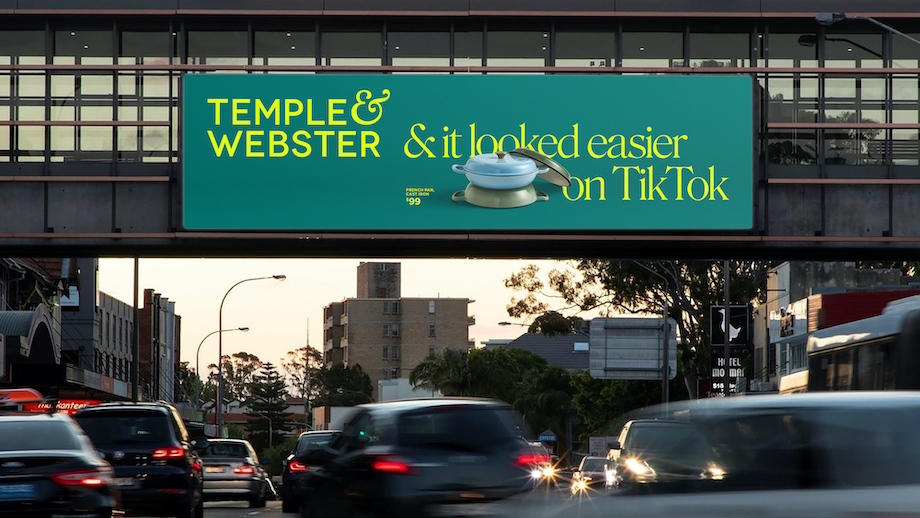
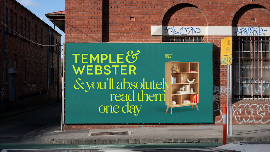
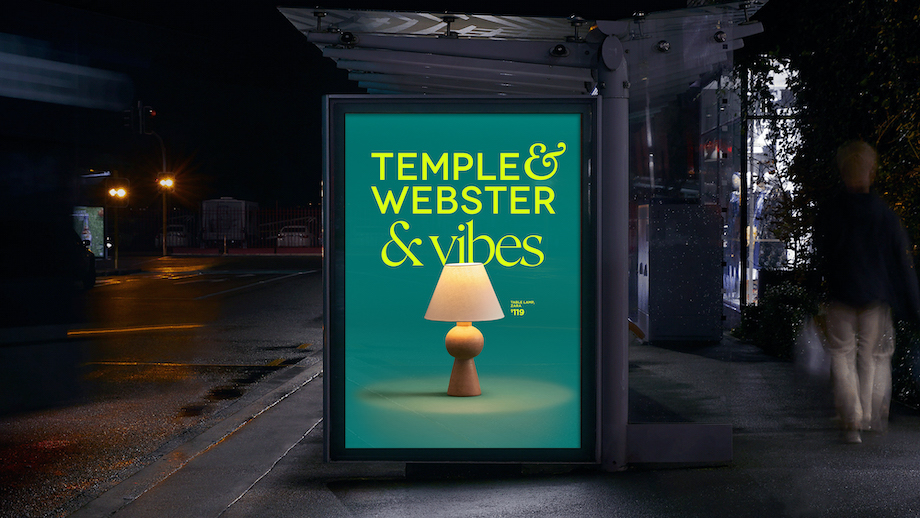
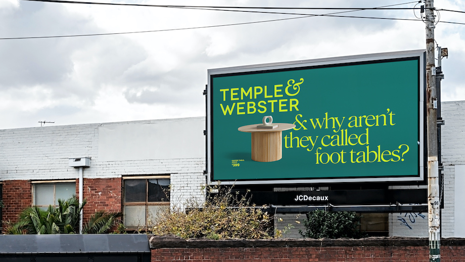
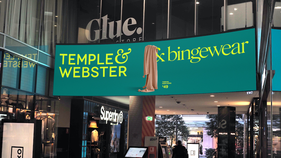
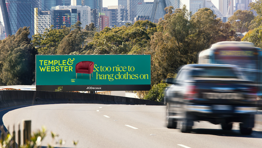
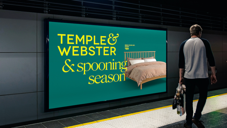
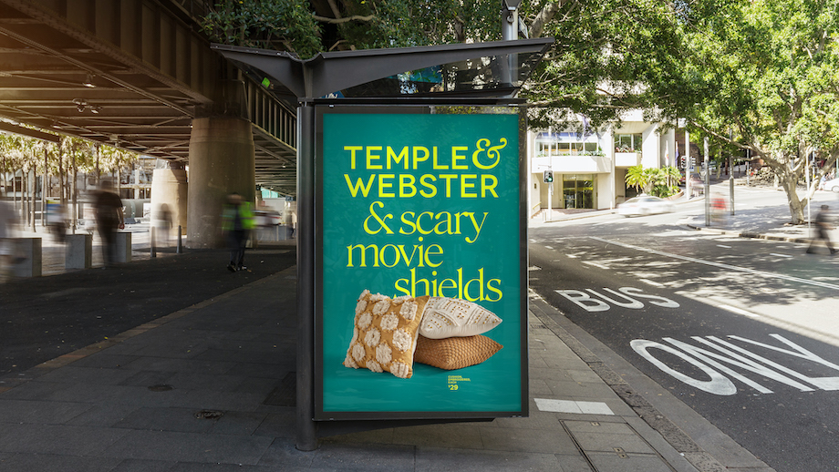
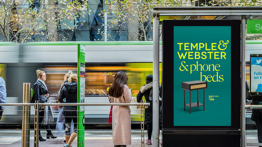
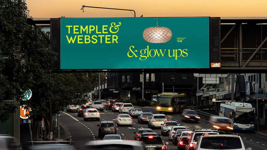
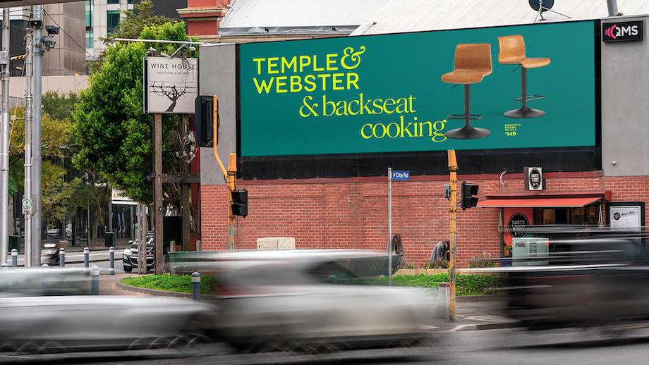
With over 200,000 products, whatever your style, you can have a beautiful home with Temple & Webster. To demonstrate this Temple & Webster, Australia’s number 1 online-only retailer of furniture and homewares, has taken over the streets of Sydney with a major OOH campaign via Howatson+Company, showcasing over 30 different products and how they beautify everyday life.
The campaign celebrates the powerful symbol at the heart of the Temple & Webster brand & shows all Australians that Temple & Webster can be there for whatever ‘&’ comes next in their life.
Says Adam McWhinney, chief experience officer and co-founder, Temple & Webster: “With over 200,000 products and intuitive tools, Temple & Webster helps Australians create beautiful spaces they absolutely love, effortlessly. And with the cost of living rising, there’s a style for every budget.”
Says Gavin Chimes, ECD, Howatson+Company: “Whether you’ve just renovated, moved out or finally bought a ‘big bed’ for your child so they can please please god go to sleep, Temple & Webster has something for every stage of life. Our campaign demonstrates this in a way that’s charming and memorable.”
The campaign will run across greater Sydney for 12 weeks.
Agency: Howatson+Company
CEO & Founder: Chris Howatson
Managing Partner: Kristie Thistlethwaite
Planning Director: Georgia Pritchard
Executive Creative Director: Gavin Chimes
Creative Directors: Doug Hamilton & Michael Kleinman
Senior Art Director: Dan Smith
Senior Copywriter: Ernie Ciaschetti
Associate Design Director: Jo Cao
Junior Designer: Jason Nguyen
Retouching – Studio Lead: Simon Merrifield
Client: Temple & Webster
Chief Experience Officer: Adam McWhinney
Head of Brand Marketing: Kristin Bengtsson
Photographer: Despina Kouloumbraki
Creative Director: Chris Deal

21 Comments
Were there no account service people involved in this project?
Another Dan and Ernie classic. Great headlines.
Can’t wait to see what work of theirs comes out next.
The same insitu mockups we all use. Did any of this run?
There’s no idea here nor any consistency apart from the use of the ampersand.
Love your work Ernie!
They’re cute but feels derivative
Why don’t you use the same & symbol as the brand?
I liked it when P&O did it.
Surely H&C have an in-house AI visual instructor who could have put these mockups together with a little more love?
Clean, simple and insightful definitions of everyday items. Love it.
The ampersand ‘idea’ has been done a million times.
& at least two times by me…
Where’s the book?
Nice writing. Feed ’em
is that really a price point and product description on a large-format outdoor? looks like a bunch of mocks ups.
That’s tish brah
As for account service? A lot needs to be going wrong to forget an entire department in the credits.
I would question whether these executions appear in these places. Show us your media plan.
They’re mock ups you silly goose.
No one actually buys that much outdoor in this country.
They run a few sad little digi sites.
Notice how the less agencies actually make, the more digi mock ups they PR?
I know. That was the point I was making. They make it look like a vast campaign, seen everywhere, yet never to be seen to this extent ever. Much like their mattress campaign.
Noice. That’s what I’m calling all bedside tables from now on.
Do you live in Sydney? They are literally on every third billboard