BWS wants Aussies to drink whatever floats their boots in latest campaign via M&C Saatchi + Carat
One of Australia’s biggest local bottle shops BWS has launched its new brand platform, ‘Refreshingly BWS’ via M&C Saatchi and Carat.
The new brand platform sees BWS double down on its mission of challenging bottle shop conventions, which is exactly what Gen Z and young millennials are looking for according to research carried out by Precision and M&C Saatchi.
The research went on to reveal the audience felt intimidated by the drinks buying experience and the unwritten rules around how, why and what they drink. As the unofficial wingman of good times, BWS is challenging this intimidation with ‘Refreshingly BWS’ and proving that they’re taking the judgement out of buying drinks and replacing it with fun.
Says An Le, head of brand marketing at BWS: “BWS has always been the cheeky yet welcoming younger cousin to the more serious bottle shops and now we’re bringing a fresh take on the world of drinks. We want to celebrate Aussies who unapologetically do drinks their way. So whether you fancy ice in your wine, enjoy seltzers at dinner parties or reach for the top shelf on a school night, BWS is absolutely here for it.”
To launch the platform, creative agency M&C Saatchi created a striking pair of human-less orange boots that make their way to a BWS store, ending with a welcoming toast to all Aussies ‘Here’s to those who drink whatever floats their boots’.
Says Cam Blackley, chief creative officer at M&C Saatchi: “For the ‘Refreshingly BWS’ launch spot we really loved the idea of setting a pair of drinking boots loose. They embody a bit of offbeat attitude without pigeonholing the drinker, apart from questionable shoe choices. We’re really looking forward to where the ‘Refreshingly BWS’ platform will go next.”
Media strategy, planning and buying was led by Carat. The strategy is aimed at balancing high reach and attention-grabbing media for Gen Z and young millennials, while still providing moments of fame and impact. The integrated campaign is running across TV, large format and Retail OOH, social, online video and in-store from today.


Client – BWS
Creative Agency – M&C Saatchi
Production Company – AIRBAG
Edit House: ARC EDIT
Editor: James Ashbolt
Music and Sound Design: MassiveMusic
Photography: Shelley Horan
Media Agency – Carat

48 Comments
Not bhed.
Toohey’s tongue wants its boots back. But still, nice to see a crack at decent headlines over boring generic retail copy.
What does boots have to do with anything? Maybe if it was part of Johnny Walkers ‘Keep on Walking’ campaign but nup, turns out it’s just boots for the sake of a punny headline.
At least have someone pick they up and do a shoey.
The retail headlines are… fine. Says a lot about the state of the industry that they’re even considered remotely clever or different.
I believe it’s a reference to “drinking boots” rather than a shoey, personally I quite like this idea & execution but appreciate it might not be everyones cup of tea/beer/wine/etc
Can we just not use that line as a community. It has been done.
If I didn’t read the write-up, I wouldn’t have known that this had anything to do with “drinking boots”. And without knowing that, it makes no sense whatsoever. It looks interesting though.
I like this, vibrant touch for an otherwise gloomy winter direction – makes me want some drinkin’ at home. The voice is kinda annoying but that’s probably a good thing. Audio panning sounds good on my stereo speakers too. Nice one.
there needed to be something else in the script. It’s literally just someone walking into a store.
This is bizarre. No insight no link to the brand apart from being orange. Weird pun at the end instead of anything to do with drinking shoes which would have helped it 1000000%
Nice visual idea. Rare these days. Not sure it makes complete sense, but it’s fun and stands out in a usually very basic sector of the market.
I have enjoyed the headlines and the thought behind it once explained. Just unable to wrap my head around the boots. What are drinking boots? I’m the target audience.
if it doesn’t make sense
It’s boots walking by themselves to a bottle shop to get lit. Think about it more simply and then it makes sense.
Most of the issues with advertising at the moment are caused by 50 people trying to make sense of an idea from the point of view of their own personal agenda. Everything is researched the hell out of. Every tiny thing has to be explained. Everything has to be ‘clever’.
Nice visuals. Boots makes absolutely no sense though.
You don’t make work like this without a client willing it on. I’m sure M&C had some much stronger concepts on the table
Good. Who directed and who was dop?
Ha nice reference. Loved that tongue spot. Great to see someone at least trying to have weird fun with ads again! Maybe the industry isn’t dead after all!
I also like this https://www.youtube.com/watch?v=u4mOSdb7DJg
I also love the 4 or so invisible man movies that have been made, oh and also the book the movies were based on. Nothings new. Ad ideas don’t always come from other ads and often not the ads you think.
Incorrect. Nothing’s new.
Nothing is new, and new is nothing. Sweet nothings whispered into a disembodied boot. It could be argued that ‘nothings’ is new?
Can we have more orange.
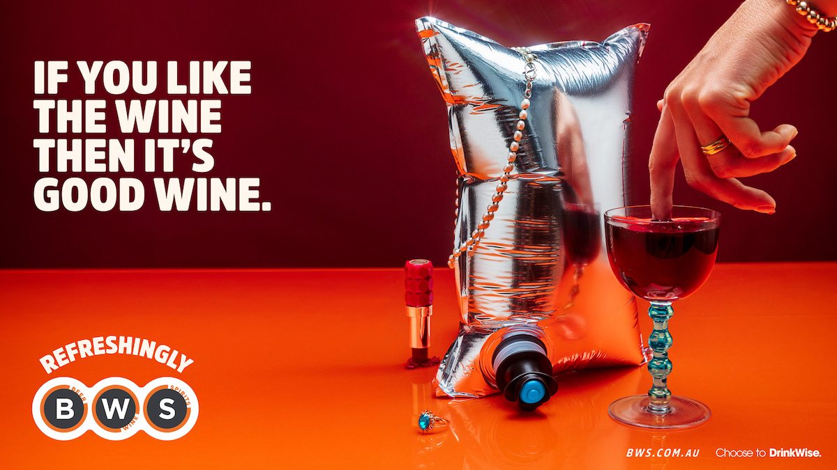
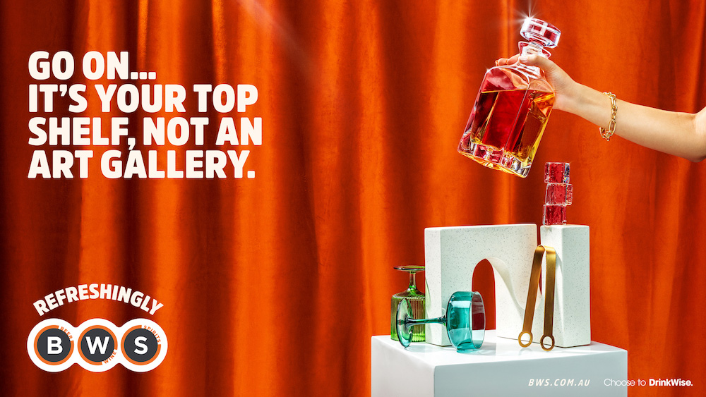
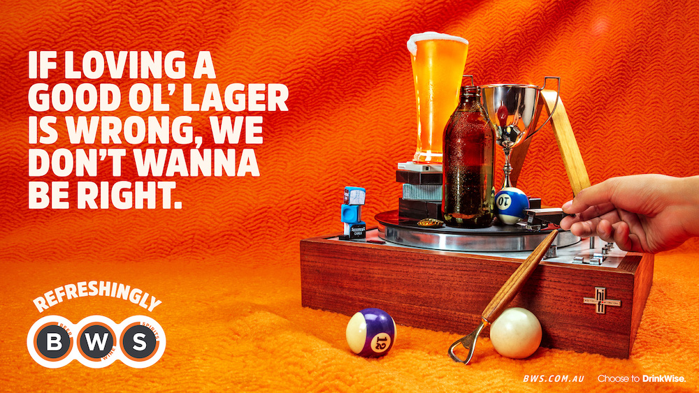
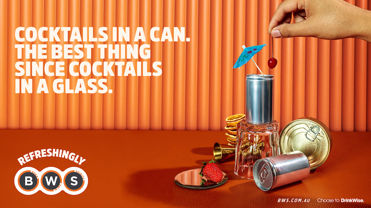
The line is terrible, the tv is very average, the print is ok – nicely art directed and a couple of better than average headlines.
I’ll drink to that.
yeah those are some of the issues. There’s also the issue of people sticking up for average work like this stuff.
Very true. But then if this is average work (given the idea doesn’t make much sense) then 99% of work put on this website is average or far below average. Best to read the room you’re in just a bit.
What does ‘floating their boots’ have to do with anything. Why didn’t they just have floating boats?
“Fill your boots at BWS”
Yes!
You’re just telling on yourself now. But hey, whatever floats your boots…
Just needed more orange brand cues.
Jealousy is fun, but hey, if that floats your boots, whatever…
is this AI?
Not a glimpse of an insight. No point of difference. Completely on brand for BWS who seem to stand for nothing. Sorry inclusivity and nothing
@on brand I don’t completely love this ad but what do you want a retail bottle shop to stand for exactly?
What insights?
You forget that ads are about entertainment to attract attention. Without that simple thing they are useless. Forget your ad school robot training and think for yourself. Use common sense and psychology.
I’m here for entertaining and intriguing. Not sure why that has to come at the cost of an insight?
There’s plenty of interesting work that is also built from human truths or cultural insights and more often than not, it’s the work that people remember.
This pair of shoes walking down the street could have been a 15 sec. I’d argue this work is neither entertaining or attention holding.
Agree with you.
But on this one you’re blindly missing the question, possibly because you don’t have an answer?
What human truths or cultural insights do you want to interpret from a retail bottle shop?
People drink alcohol? So they go to the closest place with a range of cheap beverages?
Alcohol is potentially bad for you?
What actually separates BWS from any other cheap retail bottle shop? I’ll answer that one for you. Nothing.
You personally don’t find it entertaining or attention holding, but that’s also personal taste, which is a human truth?
What work have you found entertaing in australia in the last year?
Remember we live in one of the most conservative and creatively backwards 1st world countries in the world.
Personally I thought this was pretty entertaining and built from an insight https://www.youtube.com/watch?v=5dI5ICXx73U
You can always find a point of difference if you do your job properly.
Stay at the superficial layer and you’ll have nothing to talk about. But whatever floats your boots.
One for all the angry retirees filling their days dawdling in the comment section. Of course they would love some disconnected pithy lines and a poorly art directed, extremely dated looking video with a line that has no connection whatsoever to the vernacular.
You fill boots. You float boats.
Now that you mention it… is it supposed to be an ironic mixed metaphor, a la, ‘it’s not rocket surgery’?
I dunno… I don’t hate it, but it not going to make me shop at BWS any more or any less. If there’s one outside a Woolies and I need a bottle of vino, then I’m probably going in.
The Emperor’s new ankle boots.
A few things.
@@uhuhuh
Firstly great effort with the come back.
But again you conveniently sidestepped the actual questions put forward about the specific bottle shop? Is that part of your training? Sidestepping?
Aldi is a great example, but a very easy point of difference, which it announces at the end of that ad and basically every ad they do no matter the ridiculousness. ‘Aldi is the cheapest’. People have an affinity with aldi built up over many years and with much great, brave and ridiculous advertising. Ridiculous because no matter what, they know they are the cheapest. So they make fun to point that out.
In this specific example though, BWS isn’t the cheapest, the cost if its liquor brands are the same as any other retail liquor shop. BWS doesn’t have a history of great ridiculous ads and it doesn’t have the same following because of that. It doesn’t have a clear point of difference. This is not the agencies fault, this is the brand’s fault? Legitimate question there for you to sidestep if you want?
To follow, again i ask you what do you offer in this particular circumstance? Nothing as of yet?
If you don’t like this ad and don’t think it’s perfect, that’s totally cool. You know what, it’s not perfect, but don’t try to justify your point of view with sidewinding comments which you clearly can’t back up. And comparing to aldi as a brand is ridiculous, i think you know this. If you don’t know this then we shouldn’t be talking. But i have faith in you yet!
On another note, personally i thought that particular aldi ad was one of the weakest I’ve seen in the last 4 years, and i love BMF’s aldi ads usually. They’ve done a great job, until very recently. Might have something to do with the director change? Or maybe that’s coincidence?
Whatever though, seems your boots aren’t floating at all? They should be! So maybe you need to visit your local BWS?! Get your float on.
That’s a very long rebuttal to a simple observation.
My point was that a decent agency or client or consultant could have gone a little deeper with the brand. There must be something they can own in the category be it cooler staff or more convenient locations or cooler cool rooms. Heck you don’t even have to be different just say you are. My point is this is completely vanilla work that doesn’t say anything about the brand or make an effort to be memorable in any way.
If you don’t understand why I reference the Aldi shop elsewhere work then you’re missing the point completely.
Of course i understand the reasoning of referencing the aldi work. It’s a great concept linked to a well known idea about shopping and aldi itself. It’s simple. Not the best in execution compared to other aldi work but still good.
If you can’t see the difference between a brand like aldi vs bws then you’re missing the point? Even someone not in advertising recognises why aldi is aldi. As you tried just then, unsuccessfully, nobody knows why bws is bws? The staff aren’t cooler, it’s not more convenient, and making stuff up isn’t good advertising and definitely not good strategy.
The work is the work that it is, with the brand as it is, within a very conservative and uninteresting market. Aldi are different, they’re brave, they’re also not Australian owned.
Do you not think the agency tried to push the client? Have you not had things watered down and ideas rejected by client? That said, have you seen other work by retail bottle shops? This isn’t vanilla in comparison to those. BWS should be braver for sure and aldi is a great example for any brand, but this takes time to engineer with a client.
Ponder these things logically and you will see my point.
Hopefully they give the boot to the in store bottlo experience that’s stayed exactly the same since I sold slabs of New and VB by the boatload and Jacobs Creek Shiraz for $1.99 in dozen sized cases. I like the print work. Very KFC.
‘The strategy is aimed at balancing high reach and attention-grabbing media for Gen Z and young millennials, while still providing moments of fame and impact’. This is what’s wrong everywhere – hollow, meaningless jargon.
Can someone please introduce the TV the print?
Perhaps they can work out what the idea is supposed to be, because I can’t.
Audio definitely took their inspo from this disco classic
https://youtu.be/kQu2znoKY3I