NRMA Insurance launches new ‘That one thing’ OOH campaign via Bear Meets Eagle On Fire
March 22 2022, 9:31 am | | 36 Comments
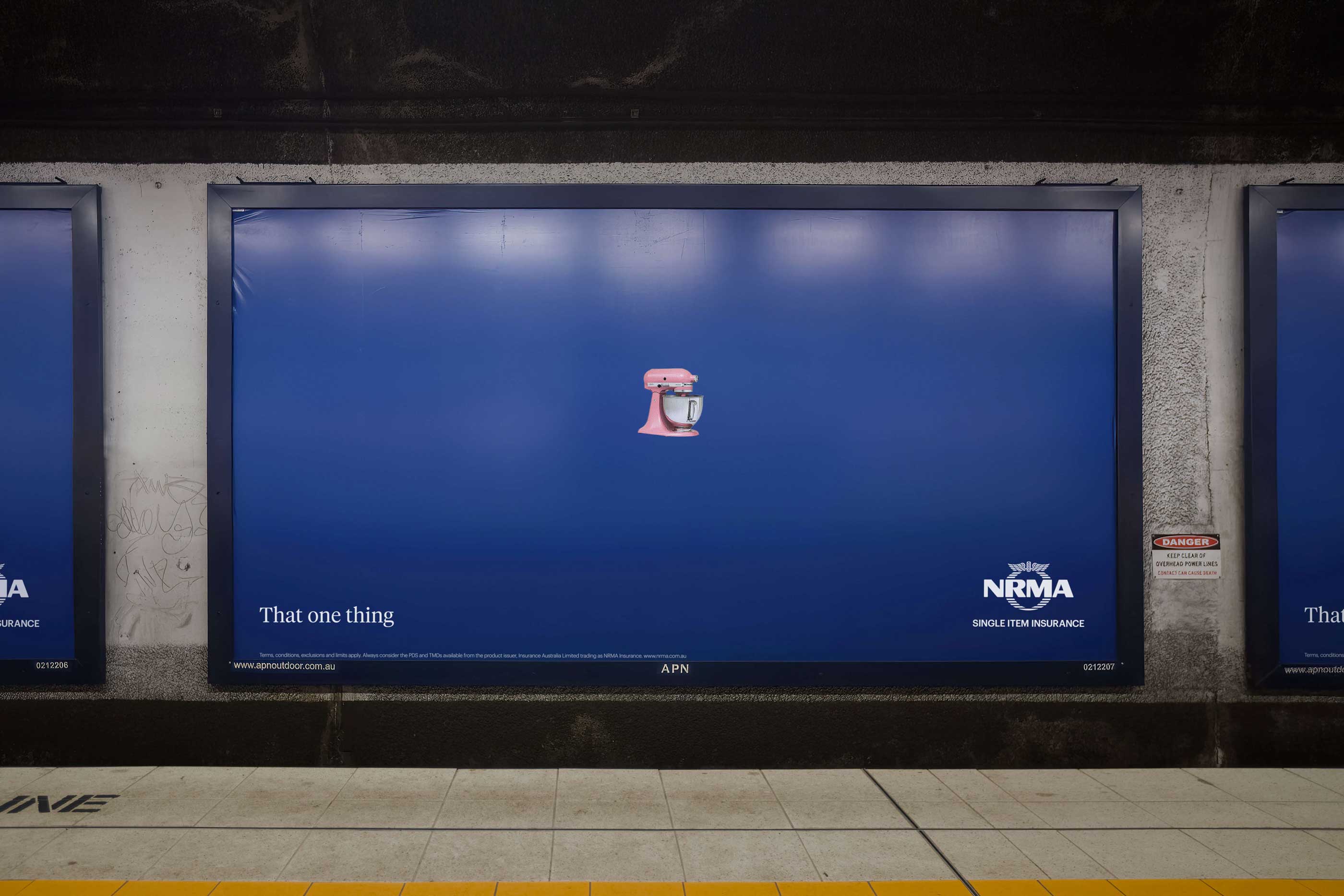
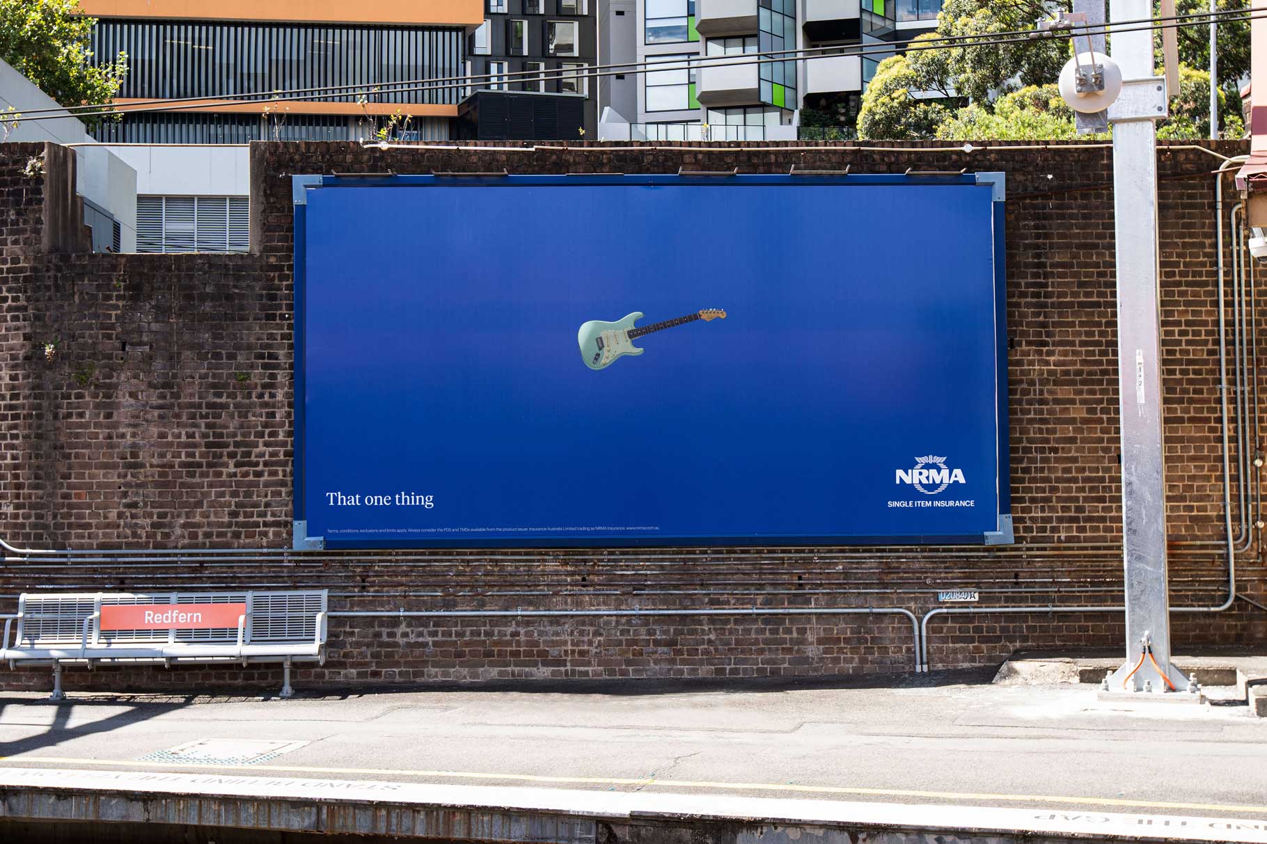
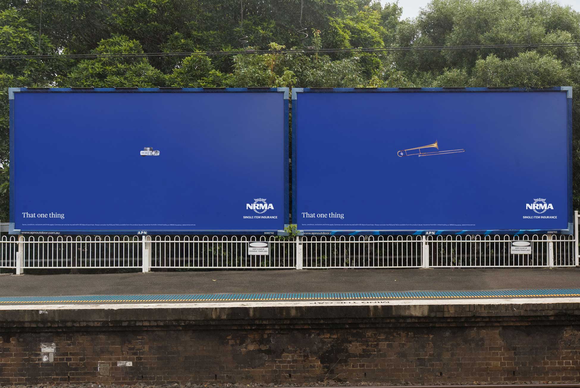
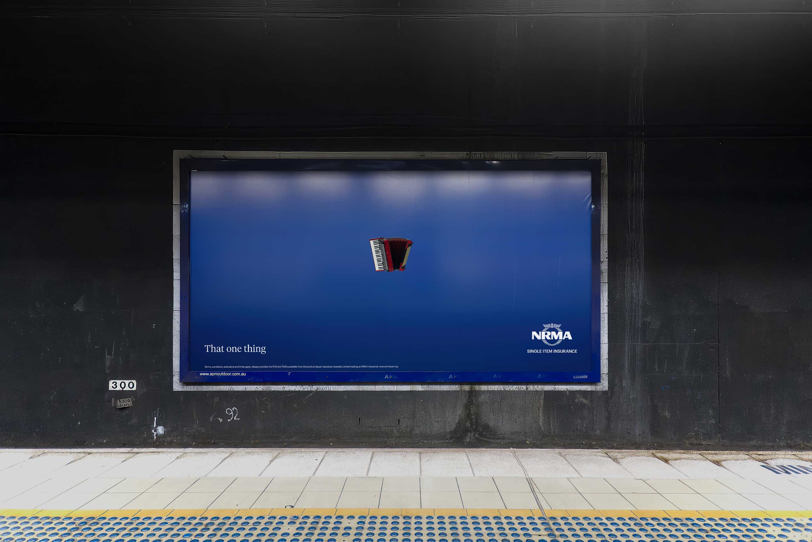
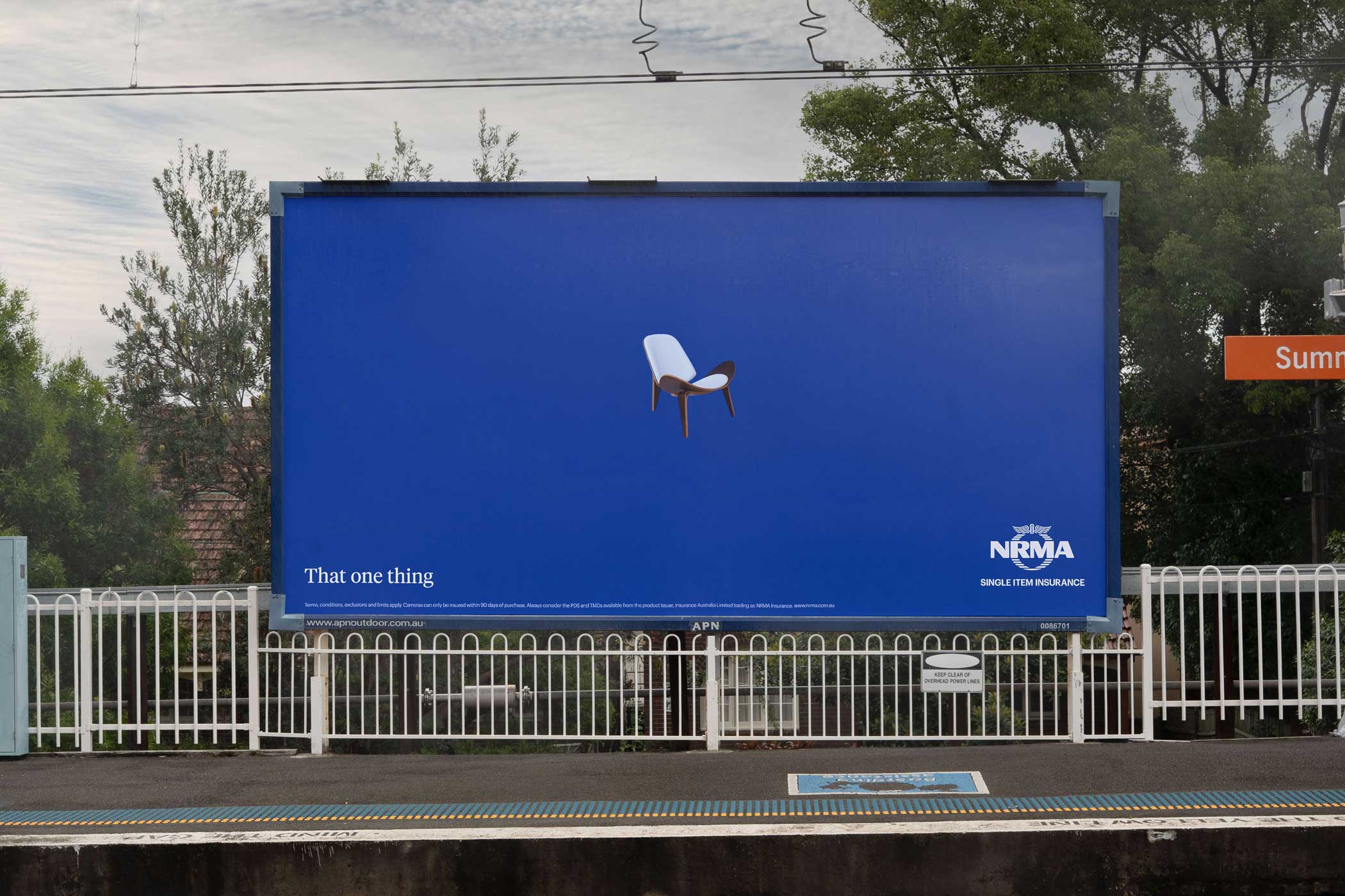
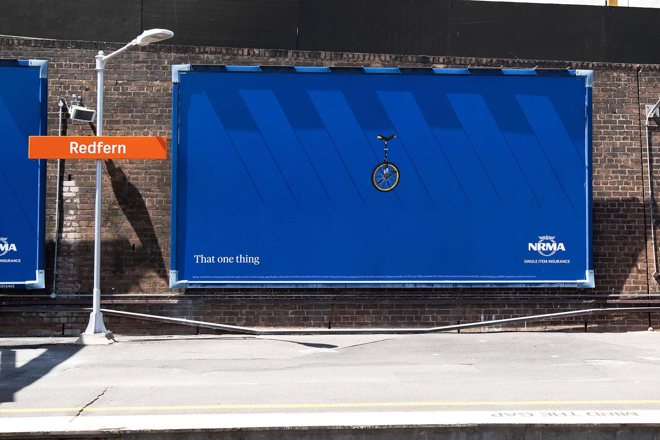
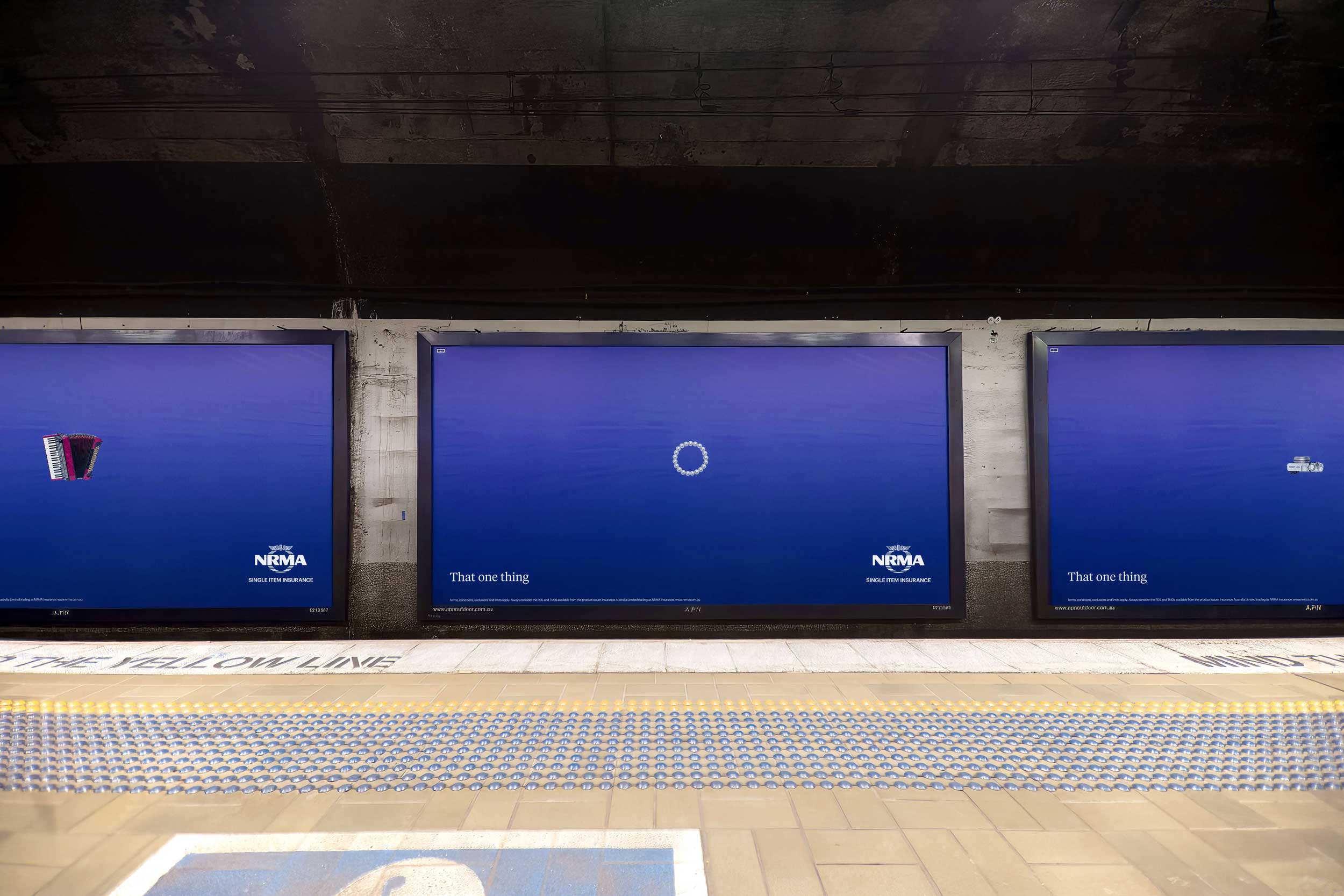
NRMA Insurance has partnered with creative studio Bear Meets Eagle On Fire with its first campaign for Single-Item Insurance — a product that lets customers insure individual items even if they don’t have an existing home and contents insurance policy.
Says Micah Walker, chief creative officer, BMEOF: “Sometimes the solution to a brief is so simple it just seems to present itself. This was one of those. Once we had the thought ‘That one thing’ it was just about using the scale and negative space of the locations to make it impactful.”
Client: NRMA Insurance
Agency: Bear Meets Eagle On Fire
Production Company: The Pool Collective
Photographer: Ingvar Kenne
Post/Retouching: Cream
Media: Initiative

36 Comments
Perfect for those commuters who stand around all day trying to decipher the meaning of ads.
I got it straight away. Simple, single-minded communication. Reminds me of when ads were good.
This is lovely.
What?
And I walked further down the platform to get a better look. I enjoy these. Lovely and simple. Communicate exactly what they need to effectively.
Can I have a job please BMEOF?
It says “that one thing” then “single item insurance”
Pretty clear to me and absolutely stands out amongst the clutter.
Very nice
The purist in me says it could have lost ‘That one thing’ to be honest.
like this, especially after buying the mrs a kitchen aid for xmas.
Bang on. Exactly.
Like the simplicity.
Bui think it’s a problem when I need to zoom up on my computer to see and understand what some of the items are.
Saw this at Redfern station the other day and thought it was brilliant. Nice one guys.
…the idea…
@ Saw these in the wild
“And I walked further down the platform to get a better look.”
Yep, because you work in advertising. Normal people don’t give a sh!t.
Your brain
… which is a very good thing.
Kudos to agency and client, alike.
I hope more and more clients are paying attention to Mr Smart.
Bravo. Proper bloody posters – what a thrill. But if only the product name could be seen at a glance…
advertising for advertising people isnt advertising.
Love how the ads are at Redfern station, the suburb has Sydneys highest theft rates
Jesus H!
You think BMEOF created this just to see if you might like it?
Obviously you’ve never run your own show.
Let me be condescending for a moment: make advertising for your peers, family or friends and you’ll soon go broke.
This is real work for a real client commented on by advertising people who appreciate the degree of difficulty in getting stuff like this over the line these days.
Go easy on the cynicism, sweeties.
Really outdid themselves with the photography.
Simps
Spotted this at summer hill a few weeks back.
The simplicity really is striking. Especially when all the surrounding ooh is littered with proof points and information. Well done.
Strong
Lacking
I wonder what they would have looked like arranged vertically down the middle of the poster. Top the image, then, ‘That One Thing’, then the logo underneath (with Sing Item Insurance) . There is something about the triangulation that is not in keeping with the simplicity of the idea. And I love them. great work
Is this seriously a product people take up that much? I must live in a bubble.
You can insure your bubble as a single item.
Lovely simple work. Nice one.
The Bird on fire self-promotion machine at it again.
If everyone getting excited about this the bar really is now low. Careful not to trip over it on the train platform.
‘Sometimes when you don’t have an idea just place an item on the brands colour background. ‘
Firstly, no I am not from BMEOF.
For people saying this is an ad for advertising people and that it lacks an idea, the fact its an OOH spot not trying to jam a convoluted idea into it means it works for punters.
It’s so simple, that people actually look at it and pay some attention, in comparison to most busy OOH spots jamming in 3 or 4 messages. The idea is simply and quickly tell people about the product in a static format. It does this well.
It seems to be a good formula to go back to simplicity to get impact, reminds me of the AirBnb stills TVC. So simple, viewers actually take note.
It’s a real shame the Aussie creative industry is so bitter.
I dunno, I reckon you could have thrown a staff member looking at the camera with a quote and attribution, a brand-spirit line, three taglines, the phone number, terms and conditions, website, search bar, tripled the logo size, a brand overlay device, some more stock photography and let Russia invade the top right corner of the ad. I mean simple never works when you can do that stuff.
@ @ simple works
Or you could just put the product name – which also explains the entire premise of the ad – in T&C sized under the logo.
Carry on about bitter industry all you want mate but this is lazy and definitely not PR worthy. Simple is great when it’s clever or intriguing. If the image was compelling instead of like an IKEA catalogue or told me something that made me think. Go look at your dads D&AD annuals and see for yourself.
this is like an ikea ad without the clever.