Sydney Airport unveils new branding via Frost*

Sydney Airport has launched a new direction and positioning for its brand with a vision to make Sydney proud every day, engaging Australian design agency Frost* to help reaffirm and communicate its position in an evolving tourism industry.
Sydney Airport is committed to innovation in travel and technology and to make the journey for customers more seamless. Frost* brings this focus to the fore, while channelling Sydney’s best qualities to instil an unmistakable sense of place, culture and perspective to its new visual identity.
Sydney Airport is the gateway to Australia. An extension of Sydney, it’s a first impression, a lasting memory and all the human stories in between. Frost* repositioned the brand from Sydney Airport to Sydney’s Airport, to embrace what it enables – humanity, warmth, energy and optimism.
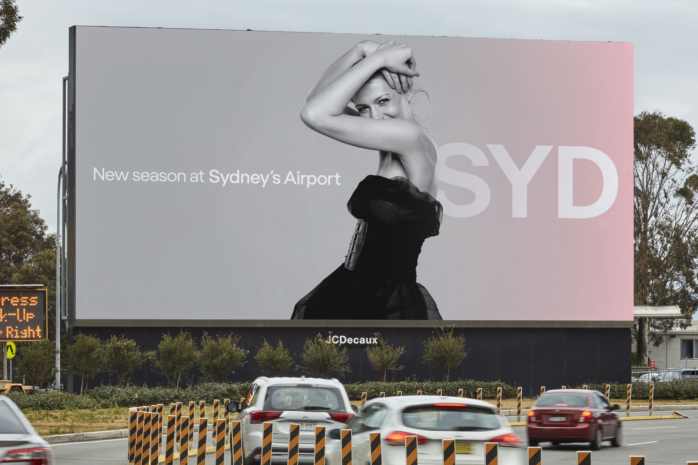
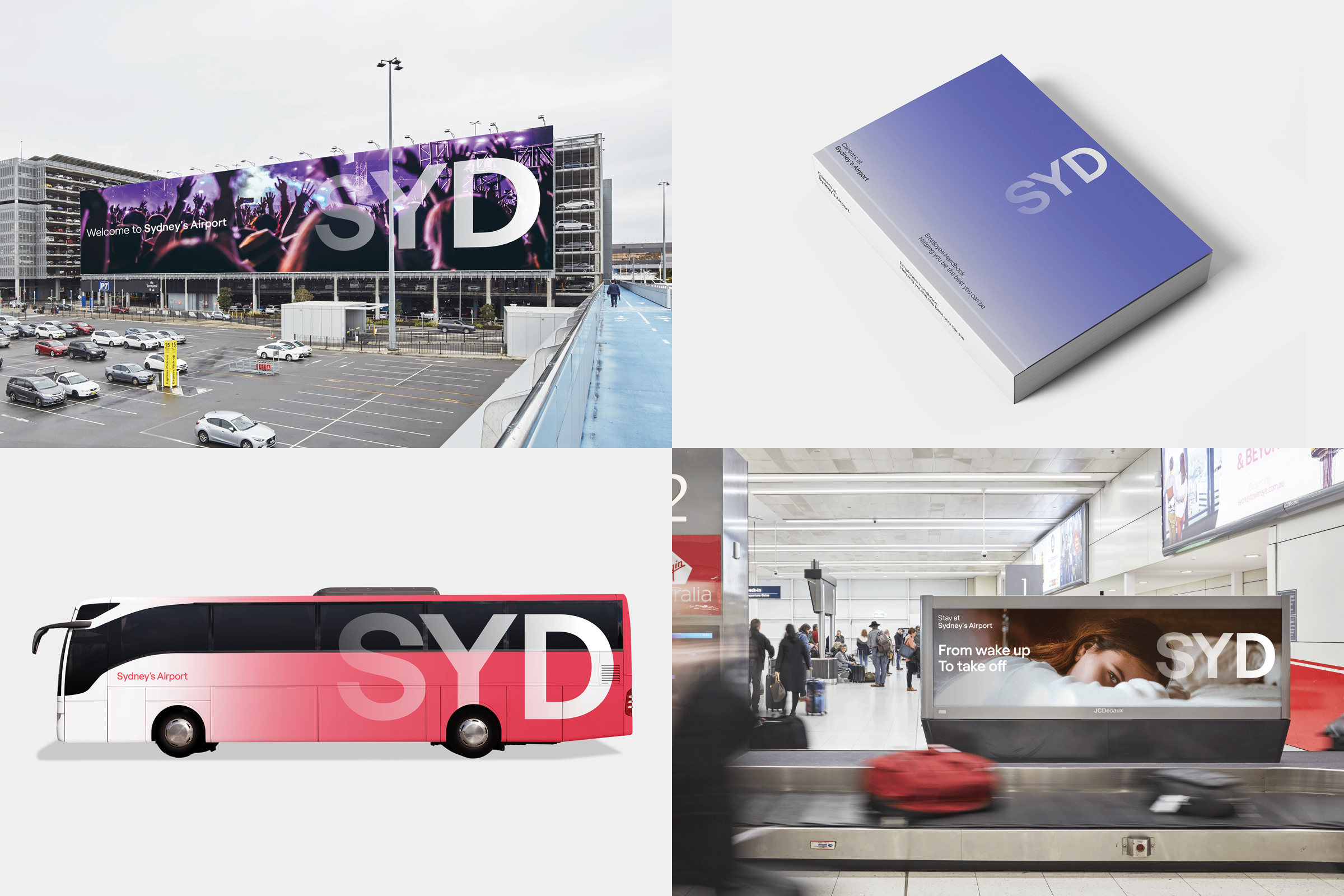
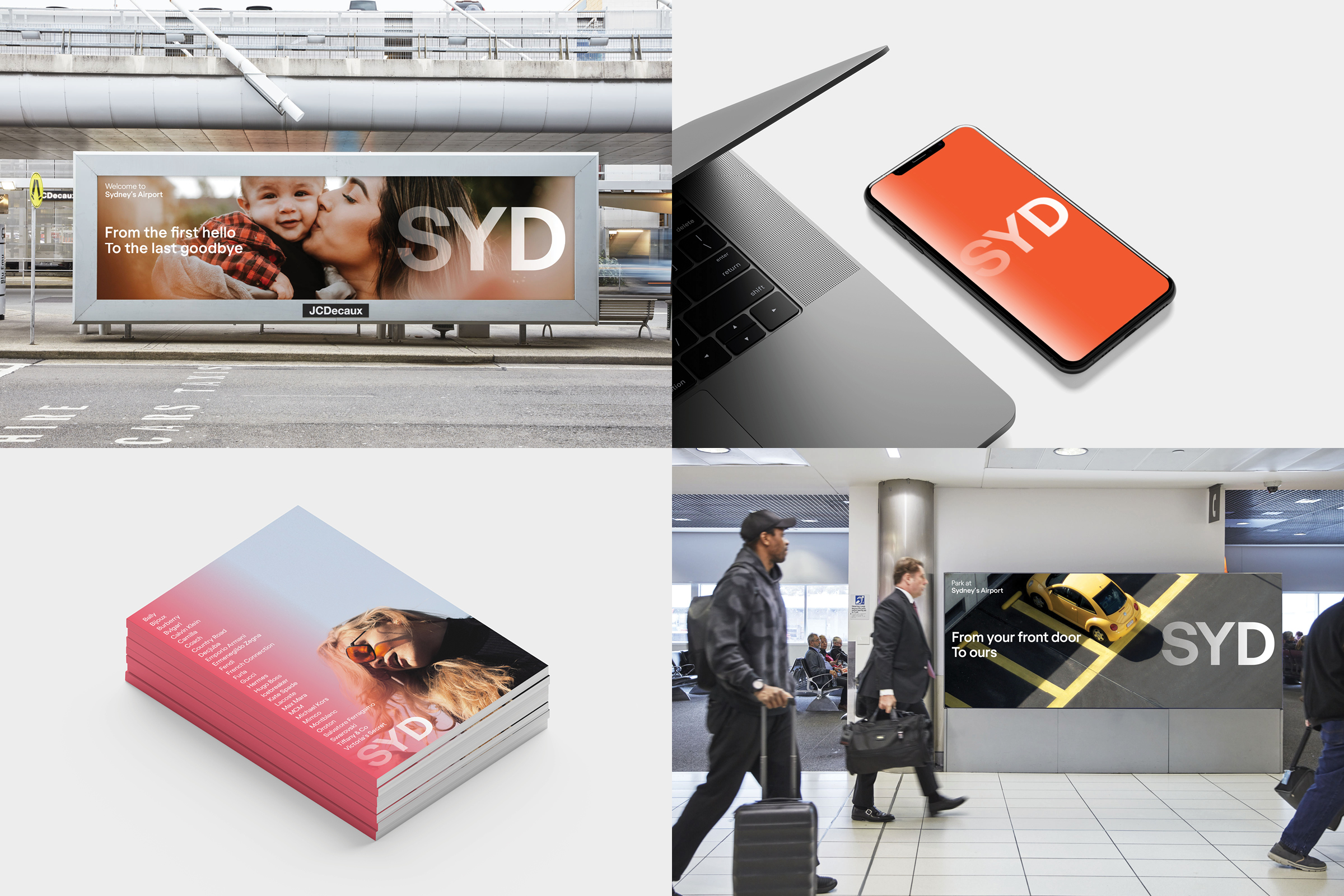
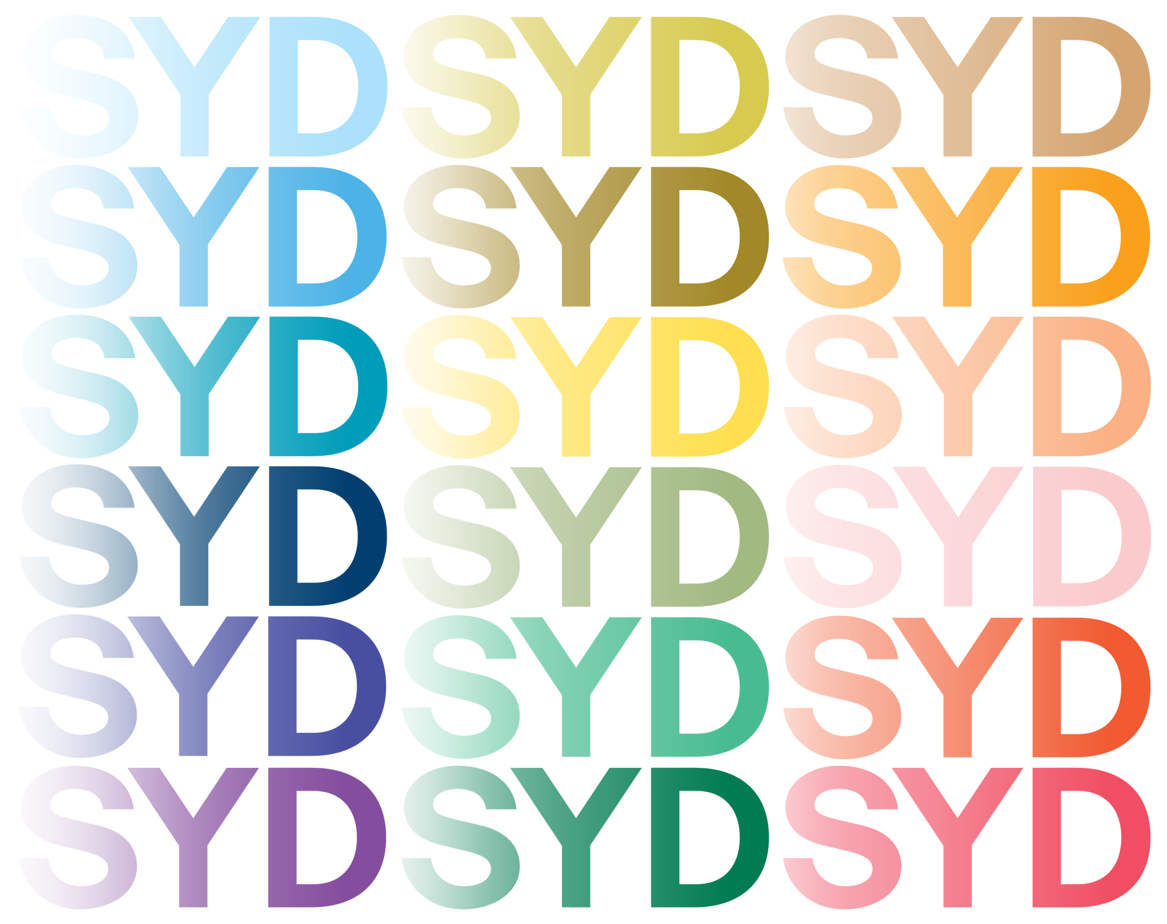
Frost* modernised the existing airport code logo using bolder, more contemporary letter forms. Built around typography, the visual identity is brought to life using colour, pattern and natural photography that captures the spirit of Sydney and enhances the emotive response to the brand.
Says Ant Donovan, group creative director, Frost*: “Sydney is not one thing. It’s an international city, a cultural melting pot, an unmistakable landscape – it’s aglow with light and energy. Our ambition was to connect the world to that Sydney feeling – that transformation that happens, the emotions we feel and the experiences we enjoy and return to time and time again.”
The graded logo suggests luminescence and movement, while the large colour palette speaks to Sydney’s vibrancy and diversity.
Says Donovan: “We wanted to celebrate the brand’s offerings through the lens of Sydney’s unmistakable landscape. To conjure a sense of place and make Sydney proud.”
The messaging framework, “From want to need, from paddock to plate, from today to tomorrow”, communicates the breadth of airport services, such as tax-free shopping, food and parking, while the emotive tone of voice captures the joy of travel.
Sydney Airport CEO Geoff Culbert said the airport’s Centenary offered the perfect timing to evolve the brand, moving away from a corporate look and feel to deliver a more contemporary vision that’s a better representation of where the airport is headed.
Says Culbert: “Our brand has been very corporate in the past and our Centenary provided the ideal timing to re-set.
“We play a big role in the lives of Sydneysiders every day, so we’re focused on investing in the things that matter, and that includes our brand.”
“The new look SYD is fresh, bright and much more approachable helping us connect with customers in a more authentic way. We’re thrilled with the work from the team at Frost* and look forward to rolling it out across multiple touchpoints.”
Frost*collective
Group Creative Director: Ant Donovan
Designer: Chris Griffiths


23 Comments
I mean, it looks nice. Just seems a bit pointless.
Normally a big fan of all things Frost*.
Sadly, this time I’m not – all a bit too insipid.
disagree
airports are like any other brands, if they aren’t creating the desired perceptions in the minds of their target market, then they will suffer as a result – not attracting the right brands into the airport, not getting the right staff to join them, not getting the support they need from public/gov etc.
It does look nice yeah (and far from being pointless) that’s the point (just not the only one)
I mean, it’s not that I don’t see the point in marketing an airport. Just that this doesn’t tell me anything that would change my travel process or options. The idea of ‘your’ airport is lovely, I just don’t feel it rings true compared to any other airport.
Maybe the airport will start doing more interesting things to live up to it, but I don’t hold my breath.
should also say, i agree, it does look nice, but it doesn’t look amazing imo. bit on the soft side. but ill wait to see it all working until i pass final judgment
I assume people rave at the airport because it’s got a 24/7 license and no lock out law?
What a difference an apostrophe makes. Shifts it from functional destination to active inclusion. Nice!
Looks like someone left the default in all the mockups.
This is really bad. A shame, could have done better. 99 designs.
What a weak logo.
This motley collection of foolishly privatised humpies needs a knock down and rebuild .
Shows sydney fading away, seems fitting.
so very underwhelming.
More Helvetica… What is this, 1999?
Welcome to 2019, and Let’s-make-everything-look-like-an-Apple-product
cant wait to experience the huge cultural shift that the airport marketing team got sold on a boozy night out with frost. Yeah Helvetica again. Seriously i could do this in indesign in about 3 minutes.
Branding for Sydney maybe… airport? There’s nothing in it that says anything remotely to do with travel. As a destination brand it says nothing about the location. Looks like a billboard for Telstra or the Ballet. Nice gradient, welcome to Sydney! This is all we have to offer.
Gradients suggest luminosity and movement now? Or just 2seconds worth of a designer’s time. Next big corporate that comes my way I’ll use a grad under a sans face too and tell them “it speaks to vibrancy”. Step 2, profit!
Looks a little familiar…
Pretty, but not loud enough to let me forget the outrageous parking fees.
For the design industry’s POV, refer to the review of this crap work on Under Construction’s BrandNew, says it all really.
This work is forgettable
Because if I want to leave or arrive in Sydney by plane, this will make a difference. Knowing that it’s Sydney’s best airport makes the choice so easy. Thanks, advertising.