Branding design agency Principals creates new identity and brand strategy for Campbelltown
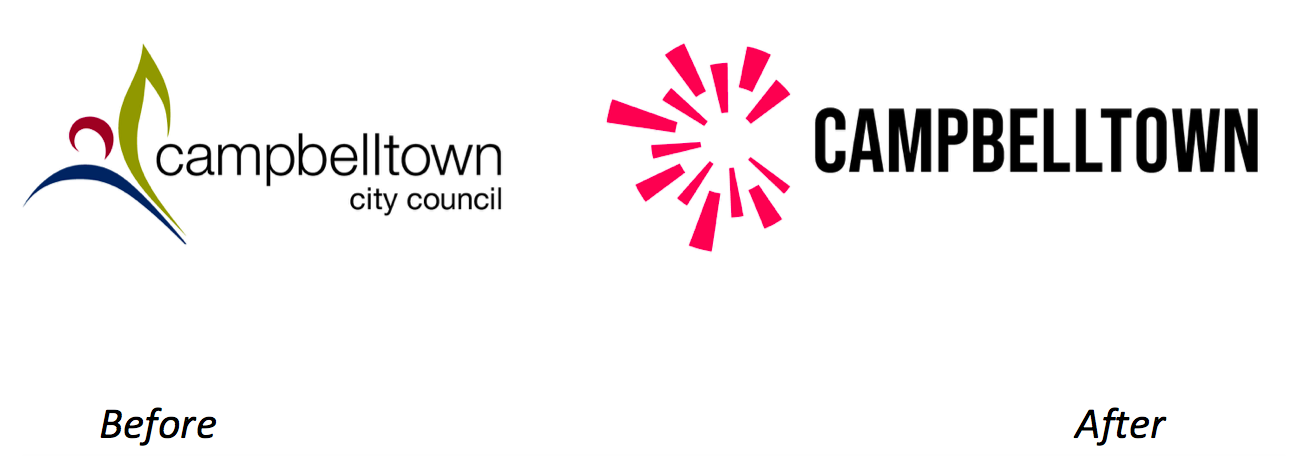
Branding design agency Principals has created a new identity and brand strategy for Campbelltown.
Identified as a priority by residents and businesses in the Community Strategic Plan, Principals was engaged to work with Council to develop a new positioning for the city. Against the backdrop of a rapidly changing Western Sydney, Campbelltown needed an updated brand story and identity that was more distinctive, easier to use and in line with the Campbelltown of today.
Principals’ multidisciplinary team worked closely with the City Council team, community and Councillors to define and create a new and more cohesive brand story and visual identity. A collaborative process saw more than 1,000 people participate in co-creation sessions, vox pops, drop-in clinics, workshops, online surveys and interviews.
The result is an all new identity, inspired by what the Dharawl land of Campbelltown has always been known for – a meeting place where diverse people come together.
Says Campbelltown Mayor George Brticevic: “This new identity belongs to everyone in our city. Our community told us what an honest representation of modern Campbelltown looks like and we have listened. Our new brand will help to continue attracting investment into the city and lets everyone know that we are open for business.”
Says Simon Wright, executive creative director, Principals: “The new brand story and identity are just one step in achieving the broader vision for Campbelltown as it continues to attract economic and cultural investment that will contribute to the area being a destination of choice to live, work, and do business well into the future.”
21 Comments
Looks like an imploding tower block. Very of the moment.
…Inspired by a broken stubbie on the footpath of life.
I’m sorry, I wanted to like it, but I just can’t unsee that.
Why do brand and design agencies keep on showcasing their work with a before/after of the logo?
People love to judge a brand on the logo, so why play into their hands.
Where’s the rest of it? The process, the workshops, the thinking, the messaging, the executions, the brand campaigns?
C’mon Principals, surely you can see you are under-representing yourself here?
this is bad
Not a single credit. Says a lot. Use of negative space is OK but this is a bit pants.
As a graphic designer, this makes me cry.
What, in your opinion, is a good logo?
Something that looks nice is a good start
If branding is all about differentiation, this telling me nothing about Campbelltown.
What a waste of council money.
What exactly do you want a logo to say?
Would you like an entire history of the area to be communicated within the letter T something?
This is a modern looking logo with workable digital application. That’s it.
Is Uber a ‘goood looking’ logo? Facebook? Amazon? Google? What do they ‘tell’ you about the company???? Nothing at all because they aren’t supposed to.
The story you’re looking for isn’t to be found within the logo, it’s in all the other parts of brand, which, as someone has pointed out already, ain’t being shown here
^^ What a cop out. A logo is the beginning and end, and should encapsulate everything about that brand and business.
I ‘heart’ new york = love for NYC
Nike tick = athleticism
Woolworths apple = fresh
Woolmark bundle = wool
Macquarie’s O = wholly dollar
Qantas kangaroo = Australia
FedEx arrow = express movement
Disney ears = mickey mouse
Amazon arrow = everything from a-to-z
If brand and design agencies can’t do this, they should leave it to the experts.
100%
200%
I am trying really really hard to not say bad things to anyone, anywhere, but this one tipped me.
From the awful dated caps screaming at me, to the bullet shattered glass/broken stubby icon to the Communist/Mcdonalds colour scheme.
Well done for picking some of the most establish and famous logos in the world and pointing out how decades of branding have built meaning into the brand, and for which now the logo is a visual trigger for people to recall that.
I rest my case
It’s clearly depicting going into hyperspace in the Millennium Falcon. I give it 10/0 Alderaans. (RIP in peace Alderaan)
Always telling, when there’s no credits. As in, no one wants to put their name it it.
Looks like a roadside cop splattered by a fugitive in a stolen car trying to avoid road spikes on the M5.
If you can’t handle the criticism then maybe don’t PR work that attracts it?
I’ve seen better ‘logos’ on shutterstock
When the client wants big budget looks but, gives peanuts. *you can’t always get what you want… you can’t always get what you want*
But if you try sometimes, you might just find you get what you need…
Talking about?
I have nothing at all do do with this work or the company behind it