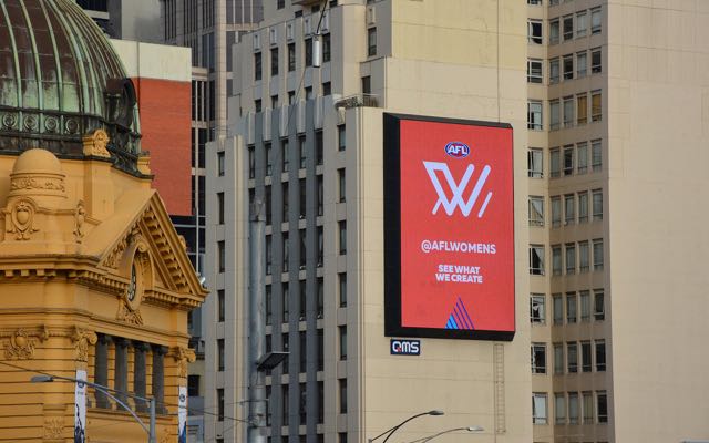
The AFL launches new ‘W’ brand mark for AFL Women’s via brand consultancy Push Collective
 The AFL has today unveiled its much anticipated ‘W’ brand mark for AFL Women’s, developed by brand consultancy PUSH Collective.
The bold mark represents a new take on the game of AFL and celebrates the extraordinary professional athletes from across Australia who will soon be able to play football in an elite women’s competition.
Says Ken Shadbolt, executive creative director of PUSH Collective: “The launch of AFL Women’s is a milestone in Australia’s sporting history. Our team was determined to create a brand identity that expressed a new perspective on the game and its traditions – an identity that encapsulates both the familiar and the progressive nature of the elite women’s style of play. We are thrilled to be a part of creating new history for the players and fans who are driving AFL Women’s, and helping to inspire future generations who no longer have to wonder whether it’s possible for women to play at the elite level.”
While exploring the unique shapes of the AFL goal posts and goal square, the PUSH team found a way to fashion these iconic elements into a deceptively simple ‘W’ mark. The ‘W’ mark will feature prominently in the lead up to next year’s competition, and will be supported by a new visual identity system that has been designed to challenge preconceptions of how football is presented in this country.
The new brand mark was revealed in a short launch video – also created by PUSH – featuring many of the league’s star players.
 Says Jemma Wong, marketing manager, AFL: “This is such a historic moment for the AFL brand. We wanted to create something that was bold, future-forward and modern, but resonated strongly with the players and fans of AFL Women’s. It also needed to be designed for digital environments and small screens as well as carrying weight in traditional media.
“The AFL Women’s brand positioning, ‘See What We Create’, places the athletes at the heart of the brand, empowering them to co-create and build the future of the league with us for future generations. We consulted with the Football Advisory Group, shared this work with clubs and players and worked closely with PUSH Collective to create a contemporary design that was powerful and aspirational. We are delighted with the results delivered by Ken Shadbolt and his team.”
Thanks to APN and QMS, the brand mark was on display today in near Flinders St Station on digital billboard sites to celebrate the launch.
Creative direction: PUSH Collective
Motion design: Gramm
Sound design: Samplify

5 Comments
Or should there not be a connecting line on top of the shadow. Is it meant to be a symbol of goal posts casting a shadow? Are you trying to make a statement about an invisible ceiling or something? I dunno, my poor man-brain is confused.
Subject critique to one side until I see the whole project…
But the goal post story is a massive reach.
Nobody.
I’m an AFL fan. And I get it – goal posts + the goal square. I think other fans will get it too, hardly a ‘massive reach’.
Looks a bit like a dish rack.
Which is unfortunate for this brand.