Industry super fund CareSuper launches new brand identity via PUSH Collective
 Industry super fund CareSuper has launched its new brand identity, developed by brand consultancy PUSH Collective. It is the first significant brand work in over ten years for the 240,000-member fund and it reflects CareSuper’s ongoing success and pipeline of innovations.
The project by PUSH has involved market research, brand strategy, and a new visual, verbal and sonic identity, informing a broad range of touch points for members, employers and the financial community.
 Says Erminio Putignano, managing director, PUSH Collective: “CareSuper is an industry super fund. It is not aligned with one particular industry, but has established a strong foothold across many sectors with professionally-minded
 people who want to set themselves up for the future. We’ve evolved its brand to connect better with these professionals – savvy, busy, and with a progressive outlook on life.
“The idea at the core of the brand is fitness – being fit for success. It applies to CareSuper as a high-performing fund thanks to its capabilities and approach to investment. It also reflects the mindset of its main member base, and how they pursue success in their careers and lives. We want to tell a story that focuses on the importance of being enterprising, adaptable and resilient in order to succeed in a world full of uncertainty.”
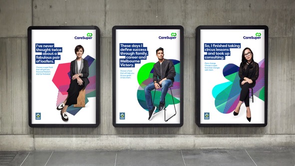
To develop the new identity, PUSH engaged renowned fashion photographer Cameron Grayson, who has created a series of portraits of CareSuper’s members that defy the common stylistic cues of the category. The photographic work has also involved Giaan Rooney, CareSuper’s brand ambassador, whose role is being recast to reflect the new brand strategy and her own remarkable personal and professional journey.
CareSuper’s executive manager – marketing and brand strategy, Peter Theodorakopoulos, said that the fund has had a long record of outperformance and grown significantly since the last time the brand was evolved.
Says Theodorakopoulos: “CareSuper has performed well during all types of market conditions, including the GFC that interrupted the entire super industry and has delivered strong returns ever since. As a result, more and more people have chosen us. Funds under management have quadrupled to $15 billion.
“Our evolved brand reflects our commitment to members and passion for performance. The changes in the brand go hand in hand with major upgrades to our service and support for members.”
The new brand identity is in the process of being rolled out. CareSuper’s redesigned website has just gone live, together with new communications for members. Later this year, a series of marketing initiatives will be released.
Market research and brand strategy: PUSH Collective
Brand identity and creative strategy: PUSH Collective
Photography: Cam Grayson
Sonic identity: Samplify
UI prototyping: MASS
Website redesign: Monkii
Creative direction: PUSH Collective
Video Director: ds2
Sonic identity: Samplify
Motion: Willy Karl Beecher
6 Comments
When ad agencies do advertising, it’s often not great.
When designers do advertising, it’s always bad.
This is very bad – the brand identity is soooooo uninspiring.
That is an uninspiring brand identity
Very plain, very boring, and too much white on my screen.
Clearly they are trying too hard to be noticed and it looks like they’ve pinched Rest Super’s colours.
I hope the members didn’t have to pay for this dismal brand change as it was a waste of money if they did.
They actually paid someone to do this? Don’t make a video next time. Your trying to save $$$ way too much.
I like the simplicity of the design, I can see that it would stand out against the noise of other advertisements in a crowded space. Investment in renewing brand identity is a good step for a business and I imagine a lot of hard work went into this.