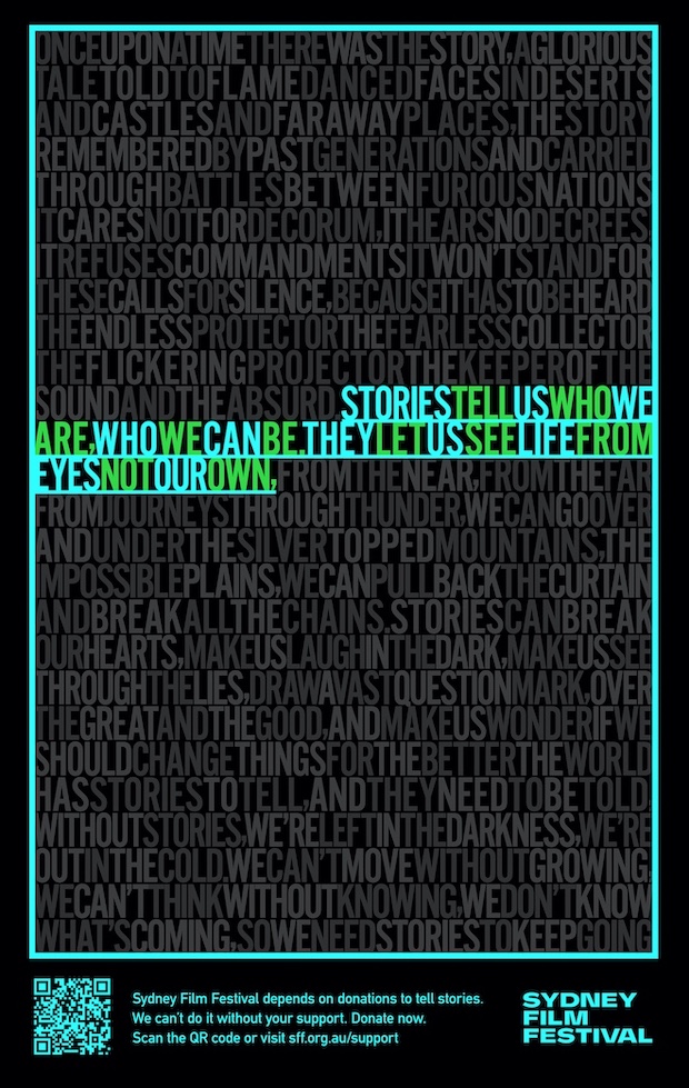
Andy Flemming on the lost art of words and typography for Sydney Film Festival

By Andy Flemming, former group creative director at M&C Saatchi, Sydney
Words aren’t as celebrated as they used to be. Even D&AD are trying to remove the ‘writing for advertising’ section as they presumably can’t find any good enough. So when the Sydney Film Festival wanted some words during Covid last year, I wrote a few and somehow managed to get Nicole Kidman, Sam Neill and a whole host of others to read them out. This year they needed some posters – so we made these.
Great words don’t need very much to make them sing – and that’s where a superb typo comes in. There aren’t many superb typos left as the words are in very short supply and they need good ones to work their mysterious, arcane, wicked magic. In this case, fitting the entire poem into a set poster size with absolutely no word spaces and making the whole thing look awesome.
The work is by the legendary Mick Tonello, who learned his craft with masters such as Dave Dye and Trevor Beattie back in the day. These are not traditional ads, they’re a celebration of words and stories. But they’re also a celebration of what typography can do when you don’t have brand guidelines to work with. There’s no agency, just Mick and I, so don’t expect them in all the award shows but I’m sticking them up here. I hope you like, you know, reading them.
The Sydney Film Festival runs from Nov 3 – 21, in cinema and on demand. Try and go if you can – they need you.
Andy Flemming is now writing and pitching for almost everyone. He hangs out at andyfl@gmail.com.
Mick can be contacted through www.micktonello.com. I urge you to do it, he’s crazy good.


7 Comments
They’re stunning mate.
Beautiful mate and well done Mike Tonello and the Sydney Film Festival. Beautiful work.
I am reminded of Bob Gill’s maxim ‘Interesting words need boring typography’
And the great copywriter David Ogilvy who said the counterpart to that ‘If you have nothing to say, sing it’
In these examples, I’m happy to be beguiled by interesting typo and interesting words…
Properly written.
Excellent use of type and design adding to the words and enhancing the story.
Why can’t there be more work like this?
In a world of shiny baubles that have distracted the industry for the past twenty years isn’t it time we recalibrated?
Beautiful work guys.
Love ’em. And no hyphens. And leading Herb Lubalin would be proud of.
ThisisacelebrationofwhattypographycandowhenyouhaveaMacbookwithabutterflykeyboardandthespacebaralwaysgetsstuck